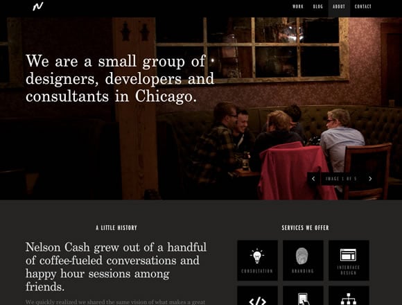
The ‘About Us’ page is probably the most overlooked section of a website and without stretching the truth, I can dare say that most designers do not give any such attention while designing this page as they tend to take as an appendage. But you need to broaden your mind to be able to realize the importance of this page.

Instead of doing something creative with the page, most designers seem happy with slapping some texts and images haphazardly on it. But this is not going to serve any purpose. Home page is certainly the most crucial section of the website as it serves as the gateway to your online presence but if you are to generate business through it, you have to make sure that the ‘About Us’ section of your stands out from the rest. Home page will help you impress the clients but in order to take a final decision, clients will definitely have a look at the ‘About Us’ section of your website.
So, it makes perfect sense to make the ‘About Us’ section as interesting and engaging as possible. Here we are going to give you some solid tips that can help you make it all the more interesting and engaging –
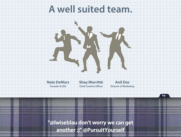
Mission and Value – You need to follow the basics while designing an ‘About Us’ page. The page should contain elaborate details about the Mission and visions of your organization so that prospective customers can understand what you are up to. By laying out mission and visions, you make it easier for clients to come to a definite conclusion.
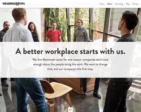
Add Personalization – You simply cannot make the About Us page boring and disgusting by loading it with what you offer, when the company was established and other blah, blah, blah. To make people read the content you need to add some personalize stuff. You can add images of your star employees or images of your company. Video can do a great job here. Just make sure that the video does not look amateurish otherwise, it will do more harm than good. We Are Mammoth website has shown the way how we should be using personalization to make the About Us page stand out.
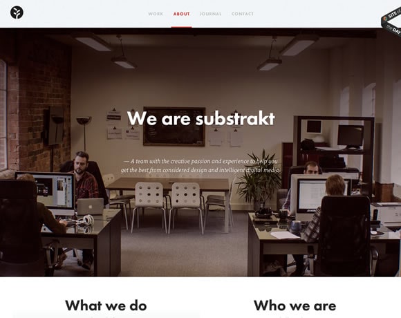
Use Big and Bright Images – All right, I have nothing against Keats and his poetry but I do believe that smalls are not always beautiful. Sometimes big is better and keeping in mind, I would like to suggest you to add big images of your company in the ‘About Us’ section of the website. Please add some funny images. Nobody likes pictures of grumpy boss dominating his employees. The picture should depict the fact that your company is an incubation center where ideas are born and creative excellence are preserved. Substrakt website has utilized the immense power of big images on its about us page.
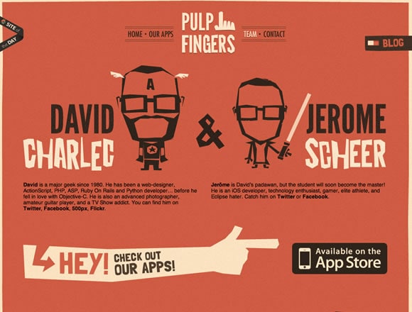
Change Your Perception – I have already said that you need to change the perception of yours regarding the ‘About us’ section of your website. Rather than treating it as an obligation, you need to treat it as an asset of your company. Once you realize how important role it does play to convince prospective customers, you will give more attention to its look and feel. Only then, something awesome and inspiring will be born. DSP website has done the same for its About Us section and it augurs well for the organization. Click here to visit their website.
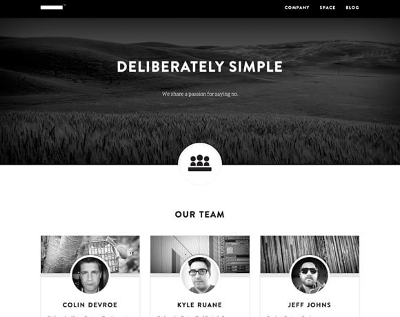
Give It A Different Look – You can always check other websites for inspiration but please do not steal the concept of others as this might have bad consequences later. Think out of the box and indulge in some brainstorming sessions and you will be able to come up with some innovative ideas that will help you replenish the ‘About Us’ section with fresh ‘blood’ and creative tidbits.
