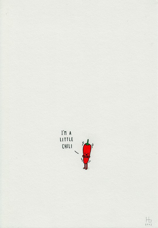
Jaco Haasbroek is a South African illustrator known for pared-down drawings that turn everyday objects, words, and visual clichés into compact visual jokes. His work sits between illustration and graphic design: simple line, flat colour, and precise composition do most of the work, while the punchline arrives through a small shift in meaning or expectation.
| Field | Illustration, visual humor, graphic design |
|---|---|
| Origin | South Africa |
| Known for | Minimal illustrations, pun-based images, editorial and commercial work |
| Style | Reduced forms, clean geometry, dry wit, strong negative space |
| Medium | Digital illustration and print-ready artwork |
What kind of illustrator is he?
Haasbroek works in a recognisable strain of contemporary illustration that relies on economy. Instead of building scenes through detail, he strips an image to the few shapes needed for instant recognition. That restraint is not just a style choice; it is part of the joke. A banana may become a phone receiver, a cloud may become a speech bubble, or a familiar object may be redrawn so that its double meaning lands at a glance.
This approach makes his work easy to read quickly, which suits the environments where it often appears: editorial pages, branding campaigns, social media, posters, and short-form visual commentary. The imagery is direct, but it is rarely blunt. The best pieces depend on a small delay in understanding, the moment when one reading gives way to another.
Why are puns central to his work?
Pun-based illustration uses language as a visual engine. Haasbroek’s images often begin with a phrase, idiom, or object name that can be interpreted in two ways, then convert that ambiguity into a drawing. The result is not decorative wordplay for its own sake. It is a method for making familiar things look newly strange without losing clarity.
This matters because the pun is doing structural work. It shapes composition, determines scale, and often sets the colour palette to a minimum. In a strong example, the visual gag is inseparable from the form of the image: if the drawing became more elaborate, the joke would weaken. That economy gives the work its crispness and its shareable quality.
How does his minimal style work in practice?
Minimal illustration depends on selection. Haasbroek has to decide which detail can be removed without destroying recognition, and which contour or colour accent will carry the meaning. That process resembles logo design as much as traditional illustration: every line has to justify itself. The spaces around the image matter as much as the image itself.
In practice, the work often uses a limited palette, smooth digital edges, and simple silhouettes. Shadows, texture, and perspective usually stay out of the way. What remains is an image that feels polished and contemporary, but also slightly mischievous. The simplicity is deliberate, not empty; it is the mechanism that allows the wit to read quickly.
Why does Jaco Haasbroek matter?
Haasbroek belongs to a broader generation of illustrators who have treated minimalism as a language rather than a neutral style. His work shows how much can be communicated with a small number of forms when concept, drawing, and timing align. That makes him relevant to designers looking for concise visual communication and to readers interested in how humour travels through images.
He also demonstrates how illustration can move comfortably between art direction and editorial wit. The same visual habits that make a joke land can also make a campaign memorable or a page feel sharper. His work is a useful example of how contemporary illustration often operates: not as ornament, but as a compact system for thought.
Frequently Asked Questions
Is Jaco Haasbroek mainly an illustrator or a cartoonist?
He is best described as an illustrator. His work uses humour, but it does not usually depend on panel sequences, characters, or narrative timing in the way cartooning does. The emphasis is on single-image concepts, often designed to communicate in one glance.
What makes his illustrations “minimal”?
Minimal in this context means reduced to the essential visual components. Haasbroek tends to use simple outlines, limited colour, and clear silhouettes, leaving out texture and unnecessary detail. The simplicity is functional: it keeps the concept legible and makes the visual pun hit faster.
Where is his work typically used?
His style suits editorial publishing, advertising, branding, and digital media, where short attention spans reward clarity and wit. The images also reproduce well at small sizes, which helps them travel across screens and print formats. That versatility is one reason minimal illustration remains commercially useful.
Articles mentioning Jaco Haasbroek