Porto is Portugal’s second-largest city and the centre of a metropolitan area on the country’s northwestern coast. Built on steep hills at the mouth of the Douro River, it is known for granite streets, tiled facades, iron balconies, port wine warehouses, and a dense historic core that still shapes how the city is experienced and used.
- Porto sits on the Douro estuary, where river trade and Atlantic access shaped its growth.
- The city’s built fabric mixes medieval lanes, baroque churches, 19th-century civic buildings, and contemporary interventions.
- Its material identity is strong: granite, azulejo tile, cast iron, and weathered stucco recur across the city.
- Porto is a working design city as much as a heritage destination, with active architecture, product design, and installation practices.
- The city’s name is tied to export, especially the wine trade that helped make Porto internationally known.
What kind of city is Porto?
Porto is a compact, layered city whose form comes from commerce, topography, and long occupation. Streets descend toward the river in tight sequences of steps, ramps, and terraces, while major avenues and bridges stitch together the older riverfront with newer districts. The city’s scale is readable on foot, but its fabric is not neat: small plots, varied heights, and later additions create a restless urban texture.
That texture matters to designers and architects because Porto does not present a blank slate. Work in the city often has to engage with existing stone structures, protected views, steep slopes, and a public realm shaped by weather, foot traffic, and tourism. A proposal can succeed or fail on how carefully it handles material continuity, shade, drainage, and the edge between old and new.
Why does Porto matter in design and architecture?
Porto matters because it is a city where contemporary design has to negotiate a very visible historical base. The city is famous for azulejo tile panels, but its deeper visual identity comes from granite, cobblestone paving, timber joinery, wrought iron, and the dense repetition of tiled roofs and painted walls. These materials give the city a disciplined look even when the street pattern feels irregular.
That same material character has made Porto attractive to architects and artists working with context-sensitive interventions. New buildings, public artworks, and event installations often stand out precisely because they are placed against a strong civic background. The result is a city where a well-handled facade, lighting scheme, or landscape move can have more impact than a large object placed without regard for context.
What does Porto look like on the ground?
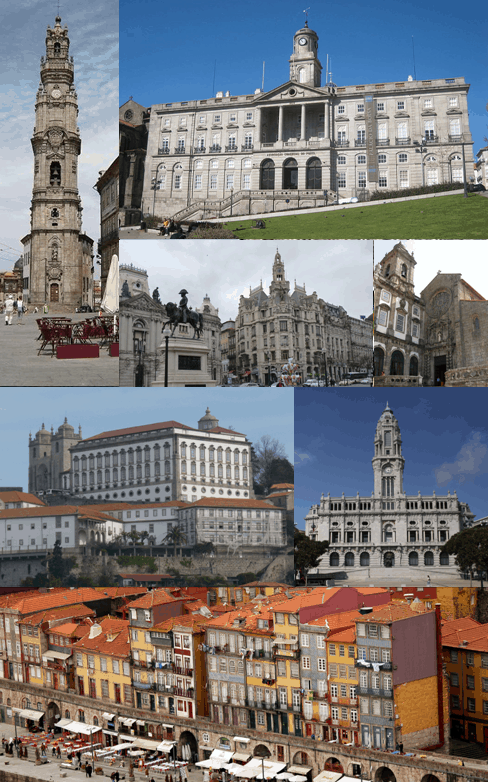
Porto is shaped by a contrast between the historic riverfront and the uphill city above it. The lower Ribeira district presents narrow streets, stacked facades, drying laundry, and a crowded river edge; higher ground opens into squares, churches, stations, and boulevards. The Dom Luís I Bridge, with its iron structure spanning the Douro, is one of the clearest expressions of the city’s industrial-era ambition.
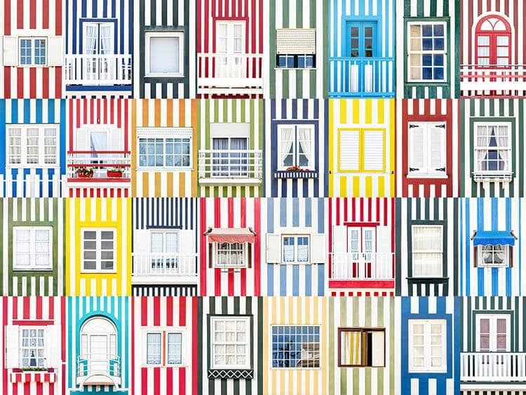
Surface detail is central to how Porto reads. Blue-and-white tilework often covers church exteriors, station halls, and civic interiors; cobbled paving and granite steps slow movement; and balconies, shutters, and awnings add a domestic scale to public streets. Even new work in the city often has to answer to these older rhythms, either by echoing them or by making a sharp, deliberate break.
How did Porto develop?
Porto grew as a port and trading city, and that commercial role gave it early importance beyond its size. River access supported wine export from the Douro valley, and the city became closely associated with the storage, branding, and shipment of port wine. Warehouses and cellars on the south bank in Vila Nova de Gaia became part of Porto’s wider urban identity, even though they sit across the river.
Industrialisation and 19th-century infrastructure left visible marks in bridges, rail stations, and civic buildings. Later urban development added new housing, roads, and institutions, but the old hill city remained legible. Porto’s present identity comes from that accumulation: medieval, industrial, and contemporary layers still operate together rather than replacing one another outright.
Frequently Asked Questions
Is Porto the same as Oporto?
Yes. Oporto is the older English form of the city’s name, derived from the Portuguese o Porto, meaning “the port.” Modern English usage increasingly prefers Porto, but both names refer to the same city.
What materials are most associated with Porto?
Granite is the most structurally important local material, especially in paving, retaining walls, and older building fabric. Azulejo tile, painted plaster, cast iron, timber, and wrought iron are also central to the city’s visual identity. These materials appear together so often that they define Porto’s look more strongly than any single style does.
Why do designers and artists keep working in Porto?
Porto offers a strong backdrop for projects that depend on contrast, scale, and context. Its historic fabric rewards careful interventions, while its active cultural scene supports experimentation in architecture, public art, lighting, and graphic work. The city gives new work immediate visual friction, which can make a project feel sharper and more memorable.
At a glance
- Address
- Porto, Portugal
- Coordinates
- 41.16214, -8.621953
Articles mentioning Porto