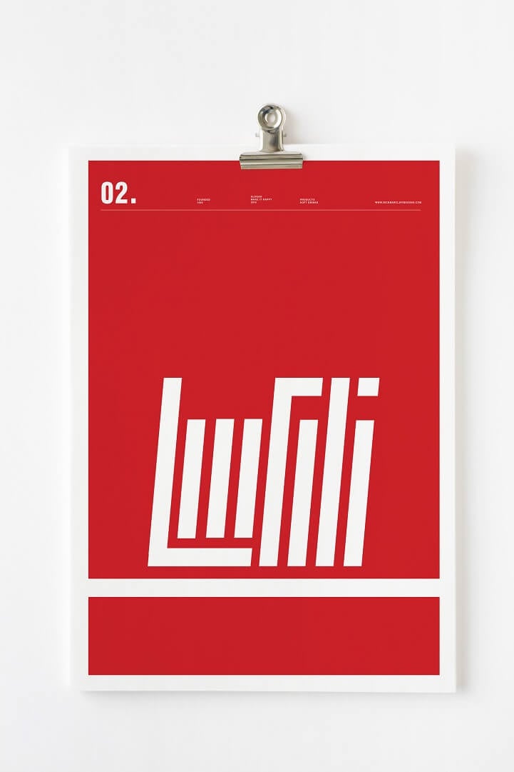
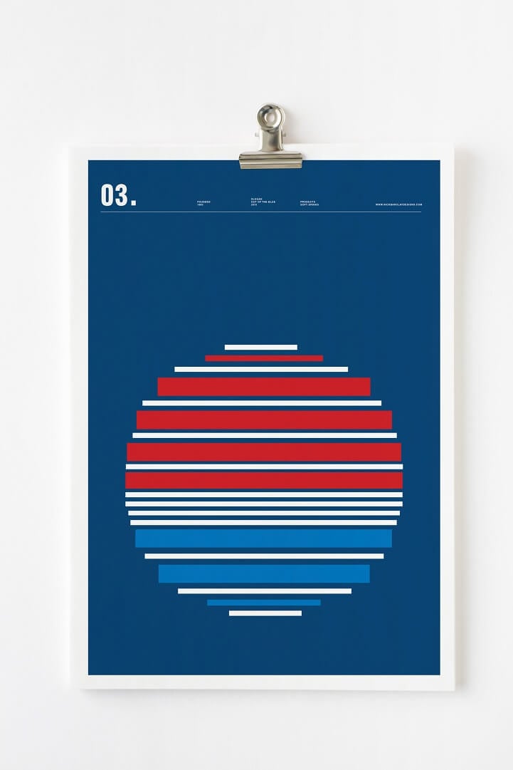
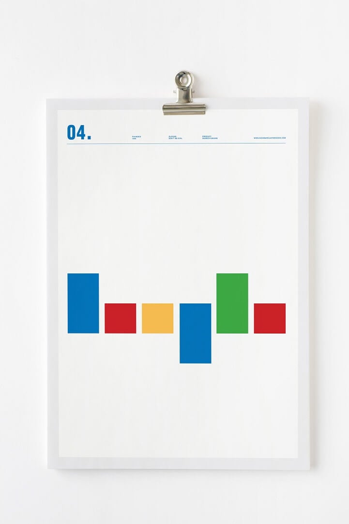
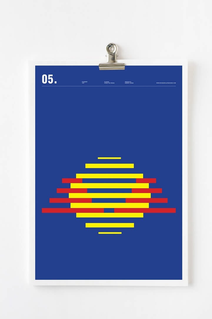
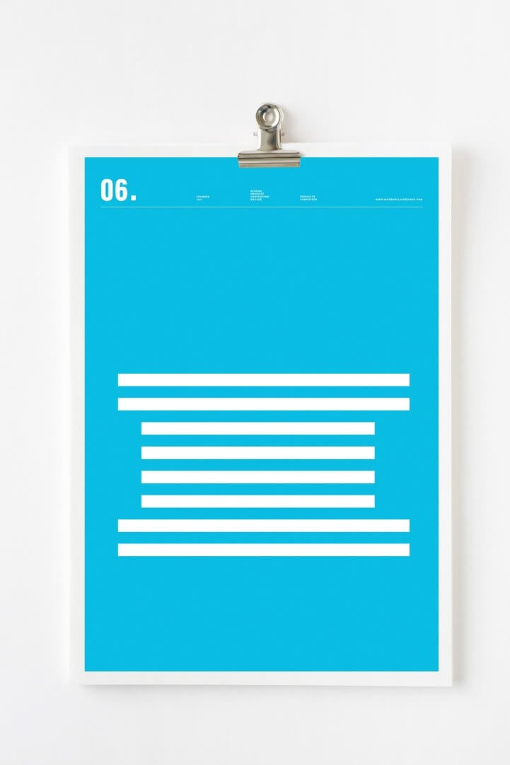
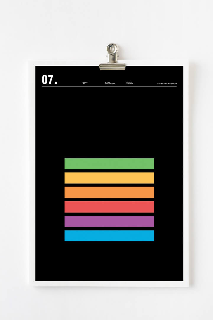
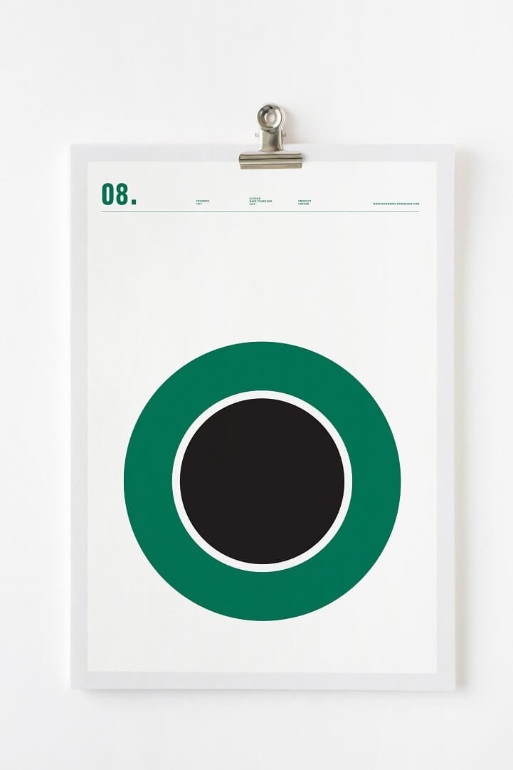
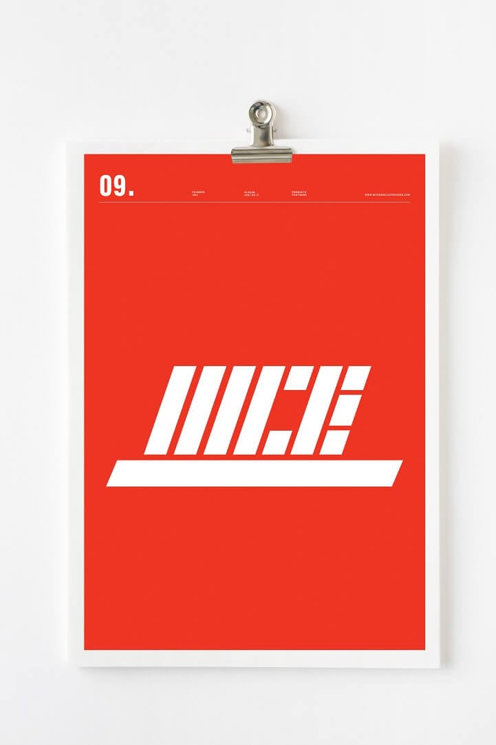
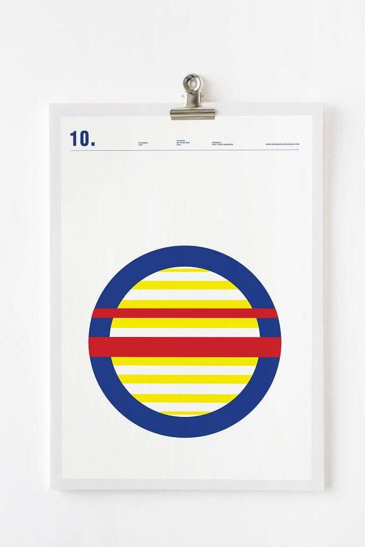
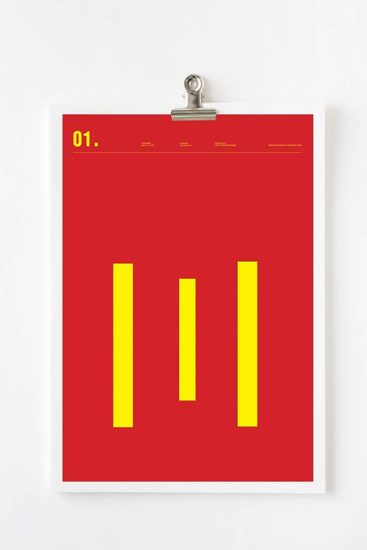
Seldom less is more, as Nick Barclay shows with his latest batch of thought-provoking minimalist posters. This new series reworks well-known commercial brand images into smooth geometric designs. In true minimalist fashion, Barclay’s works typically forgo traditional artistic guidelines, yet keep a unique aesthetic appeal. His twist on familiar logos demonstrates just how ingrained into our mind they have become, as they remain recognizable even in this simplified form of lines and circles.
via Nick Barclay
