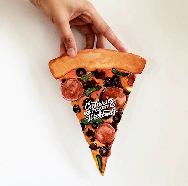
June Digan is a Filipino lettering artist and illustrator known for watercolor typography that sits between hand-painted lettering and illustration. Her work uses brush, ink, and pigment to build letterforms with visible texture, soft edges, and a handcrafted, often romantic feel.
| Field | Lettering, illustration, watercolor art |
|---|---|
| Known for | Hand-painted watercolor lettering with decorative illustration |
| Origin | Philippines |
| Materials | Watercolor, brushes, paper, ink, digital finishing in some projects |
| Practice | Custom lettering, posters, social media graphics, editorial and branded illustration |
What makes June Digan’s work distinct?
Digan’s lettering is recognisable for its painterly surface. Rather than aiming for the crisp geometry of digital type, she often lets strokes vary in width, color bleed slightly into paper, and embellishes letterforms with floral or botanical details. The result feels closer to an illustration that contains text than to standard typography.
That approach matters because it shows how lettering can carry mood as well as information. In her hands, words become visual objects: readable first, but also expressive, decorative, and tactile. This makes her work useful in branding and editorial settings that want a softer, more personal voice.
How is watercolor lettering made?
Watercolor lettering begins with drawing the structure of the letters, either lightly in pencil or directly with a brush. The artist then builds the forms with pigment, adjusting pressure, water content, and brush shape to create thick and thin strokes. Because watercolor is absorbent and unpredictable, the surface texture becomes part of the final look.
In practice, this process can include multiple layers. An initial wash may establish color, followed by darker strokes for definition and smaller painted details for ornament. Some lettering artists finish digitally to clean edges or prepare files for publication, but the handmade quality remains central.
Why does her work sit between painting and typography?
Typography usually depends on repeatable letterforms and strict spacing. Painting, by contrast, allows more freedom in texture, line, and composition. Digan works in the space where those two logics meet: the letters must still read clearly, but they also behave like painted marks on a page.
That overlap is important in contemporary visual culture, where brands and publications often want type that feels human rather than mechanical. Her work offers one route toward that goal without abandoning legibility. It also reflects a broader revival of hand lettering, especially in social media design, stationery, wedding graphics, and lifestyle branding.
Where does her work appear?
Digan’s lettering style is commonly used in commissioned illustration, quote graphics, event materials, and decorative editorial pieces. The technique works especially well in contexts where a short phrase needs to do more than communicate information. It can signal warmth, craft, intimacy, or celebration before a reader even parses the words.
Because watercolor lettering scans well and photographs beautifully, it has also traveled well online. That visibility has helped artists like Digan reach audiences far beyond local print or gallery settings. Her work shows how a handmade process can still thrive inside digital publishing and social platforms.
Frequently Asked Questions
Is June Digan primarily a typographer or an illustrator?
She is best understood as both, but the balance leans toward illustration-driven lettering. The letterforms are designed to be read, yet they are treated as visual compositions rather than neutral type. That is why her work is often described as sitting between painting and typography.
What tools are typical in watercolor lettering?
Artists usually work with watercolor paint, brushes of different sizes, good-quality paper, and pencil for planning. Some also use ink or digital editing after painting to sharpen details. The specific look depends on brush control, water level, and how the pigment settles into the paper.
Why is hand lettering still relevant?
Hand lettering offers a distinct voice that fonts alone cannot always provide. It can be customized to a message, a brand, or a mood, and it carries the evidence of the maker’s hand. In a digital environment full of standardized type, that material presence stands out.
Articles mentioning June Digan