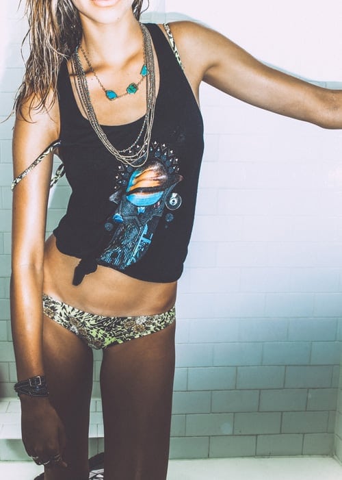
RVCA is a California clothing company known for mixing surf, skate, art, and streetwear into a single brand identity. Founded in Costa Mesa, it built its reputation on graphic T-shirts, boardshorts, caps, and other casual garments, while also acting as a cultural platform for artists, photographers, and athletes. Its name is often misread because of the logo: the letters look Roman, but the word is pronounced “Ruca.”
- Founded in Costa Mesa, California.
- Works across apparel, accessories, and visual culture.
- Best known for surf and skate-inflected clothing and artist collaborations.
- The logo uses Roman letterforms that make “RVCA” look like “Ruca.”
- Its identity is built as much through graphic design as through garments.
Where did RVCA come from?
RVCA emerged from Southern California’s surf and skate scene, where clothing brands often grow out of local sports culture rather than formal fashion systems. That background matters because it shaped both the products and the tone: durable basics, strong graphics, and an affinity for independent creative communities. The company’s base in Costa Mesa placed it close to the surf industry and to the broader Southern California network of board sports, photography, and youth culture.
From the start, RVCA positioned itself less like a seasonal fashion label and more like a cultural brand. Its clothing appeared alongside art shows, zine-like visuals, and athlete sponsorships, which helped it move between skate shops, surf shops, and lifestyle retail. That cross-over identity became part of the brand’s recognisable character.
Why does the logo look like that?
RVCA’s name is designed to be read through Roman lettering rather than through standard modern typing habits. The “V” stands in for a “U,” and the “A” appears without a crossbar, so the word visually resolves as “Ruca.” This makes the mark feel stylised and slightly cryptic, which is one reason it has remained memorable. It also gives the logo a clean, almost architectural look that works well when embroidered, printed small, or placed on a garment hem or chest.
The logo is not just a wordmark; it functions like a visual code. On clothing, that code can be deployed plainly on a label or exaggerated as a graphic element across a T-shirt or boardshort. The result is a brand sign that reads as design before it reads as text, which suits a company that sells both apparel and image.
What does RVCA make in practice?
RVCA makes casual clothing rooted in board sports: T-shirts, hoodies, woven shirts, swimwear, jackets, hats, and accessories. Materials tend to follow the demands of the category. Swimwear relies on quick-drying synthetics and reinforced seams; skate and streetwear staples use cotton jersey, fleece, denim, and sturdy blends that can withstand repeated wear.
Its lookbooks and seasonal campaigns often present the clothes in pared-back settings, with an emphasis on fit, print, and silhouette rather than runway styling. Graphics are central: logo marks, illustration, photographic prints, and artist-led designs turn simple garments into carriers of subcultural identity. In practice, RVCA’s products are ordinary in form but distinctive in presentation, which is exactly how many successful action-sports brands operate.
How does RVCA fit into visual culture?
RVCA matters because it sits at the intersection of commerce and cultural production. The company has long used collaborations and artist initiatives to connect apparel with contemporary illustration, photography, tattoo imagery, and skateboard graphics. That approach gives the brand a role beyond retail: it becomes a distributor of visual styles associated with independent creative scenes.
For readers of design and visual culture, RVCA is a useful example of how branding can borrow from and feed back into subculture. Its identity depends on typography, logo treatment, garment labelling, and campaign art as much as on fabric or cut. Even when the clothes are simple, the presentation is tightly designed, and that design work is what makes the brand recognisable across different product lines and contexts.
Frequently Asked Questions
Is RVCA a fashion brand or a sports brand?
It is both, but it is most accurately described as a surf-and-skate apparel brand with a strong graphic identity. Its products are designed for casual wear and board-sport culture rather than formal fashion categories. The brand’s clothing, art collaborations, and retail positioning all reflect that hybrid role.
Why is RVCA pronounced “Ruca”?
The spelling uses Roman letterforms in a way that makes the word look different from how it sounds. The “V” represents a “U,” and the “A” is drawn without a crossbar, so the full name resolves visually as “Ruca.” This kind of logo treatment is common in branding that wants a mark to feel distinctive and symbolic.
What makes RVCA’s design approach distinctive?
Its design approach combines simple garments with a carefully managed visual language. The brand relies on logo placement, artist graphics, and clean product photography to create meaning around otherwise straightforward clothes. That balance between basic apparel and strong identity is a major part of its appeal.
At a glance
- Founded
- 2001
- Address
- Costa Mesa, United States
Articles mentioning RVCA