

Title cards are doing more work this year. Six 2026 films use the movie title cards that appear before the action starts as a storytelling tool, not a formality.
Also called intertitles, these cards date to the silent era. Their lettering and layout have long rivaled the best movie posters. The strongest examples still do more than name the film.
A good card gives the viewer a beat to settle in. Each example below uses type, material or placement to set a mood before the story takes over.
Six movie title cards, six approaches
28 Years Later: The Bone Temple
The Bone Temple card breaks from the film’s poster style. The poster uses sturdy sans serifs and a clean layout. The card looks hand-drawn and loose, and its wobbly lettering gives it an almost childlike quality.
It appears right after a brutal opening. In the silence that follows, the card resets the audience’s pulse. Set against a temple of bones, its blood-red lettering still feels faintly eerie.
Wuthering Heights
Director Emerald Fennell’s Wuthering Heights card is built from hair, including strands from the lead actors. Filmed in stop-motion, it feels playful and unsettling at once, which suits the chaos that follows.
“We wanted it to feel completely human,” Fennell says in a behind-the-scenes preview. “It’s really thrilling to show the hands that make something.” The card makes the craft visible. Its tactile look shows how much a title sequence can carry.
For a hand-drawn take on movie storytelling, Independent Artists Revive Disney’s Wish in 2D shows how traditional animation can carry emotion as strongly as any live-action title sequence.
The Drama
The Drama opens with mismatched type. Script, stately serifs and bold sans serifs crowd together on the screen. The clash signals disorder inside a calm dance scene, and the unease starts in the first frame.

The letters flash by for only a moment, as if the image has glitched. Set in plain white, the movie title card pits order against disarray and leaves the viewer on edge.
Obsession
Obsession uses an integrated title card design, a device many filmmakers favour. After a harrowing scene, the protagonist, Bear, lies weeping on his bed while a tense score creeps in.

Then the frame slides downward, and the film’s name turns up sewn into the bedding. The ordinary setting makes the effect eerie. The horror feels close by, not distant.
Wildwood
Wildwood’s card was made by hand. Each letterform carries its own texture, drawn from natural wood grain, crawling ivy and pigment details. Laika, the animation studio behind the film, has promoted its handmade approach, and the card fits that public stance. A behind-the-scenes video from Laika shows the title reveal.
Read as a statement, the card pushes back against the flood of AI-generated imagery in cinema. Its slow, time-intensive construction shows what careful human work looks like on screen.
The debate over machine-made imagery runs beyond title cards, as Nicolas Cage Rejects AI Waiver for Spider-Noir shows, offering a useful look at where studios draw the line.
Resident Evil
The Resident Evil movie title card is one of the most debated here, for a reason beyond its design. Fans of the games expected the franchise’s iconic title voice narration. Director Zach Cregger chose to leave it out.
The decision works. A tense, thumping score meets a bold title that warps rapidly on screen. The effect is eerie without the games’ campiness. The grungy lettering captures the film’s slide into raw horror.
What the cards show
Movie title cards now set the tone before the first scene plays. These six examples prove that a few seconds of type can shape a film as firmly as a score or a cold open.

Source: creativebloq.com
Frequently asked questions
What are movie title cards also called?
Movie title cards are also called intertitles. The article notes that these cards date back to the silent era.
Why did the Resident Evil movie leave out its title narration?
Director Zach Cregger chose to leave out the franchise’s iconic title voice narration, which fans of the games had expected. The article says this decision works, creating an eerie effect without the games’ campiness.
How was the Wildwood movie title card created?
The Wildwood title card was made by hand, with each letterform carrying its own texture drawn from natural wood grain, crawling ivy and pigment details. Its slow, time-intensive construction is read as a statement against the flood of AI-generated imagery in cinema.
How does the Obsession title card appear on screen?
In Obsession, the title card is integrated into the scene: after the protagonist Bear weeps on his bed, the frame slides downward and the film’s name appears sewn into the bedding. The ordinary setting makes the effect feel eerie and horror seem close by.
More in
Cinema
All Cinema


More like this

“Famous People Lettering” by Swedish Illustrator Patrik Svensson

"Play" - Experimental Typography Of Unconventional Materials and Techniques

Six Unconventional Horror Film Posters Elevate Classic Designs with Distinctive Artistry
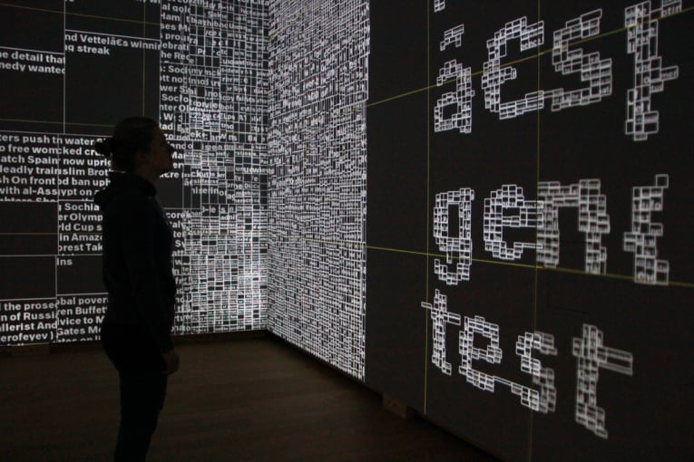
Interactive Installation: Type / Dynamics

"Messi's On-Field Moves Transformed into Art: The GOAT Font by Rexona"
