With the highly controversial logo soon to be gone from our billboards and television screens once and for all, we decided to take a look at some other well-known logos and find out exactly how much their respective creative agencies charged for them.
Of course, the worth of a logo is a famously hard thing to determine. The very fact that a simple or low-key design often works far better than something intricate or brightly colored means traditional methods for calculating how much to charge – using things like time and experience – are often thrown out the window. As such, some of the most famous logos of all time have been commissioned for next to nothing, while astronomical sums have been paid for designs most people wouldn’t think about twice. So here you have it, a rundown of logos, spanning a price spectrum of $0 to $211 million USD.
Nike – $35
The “Swoosh” is perhaps one of the most well-known “cheap” logos – costing the sports brand just $35 USD when co-founder Phil Knight commissioned graphic design student Carolyn Davidson back in 1971. When it was finished, Knight said “I don’t love it… but I think it will grow on me.”
The iconic logo has remained relatively unaltered since its conception, with the only change being made in 1995 when the brand ditched the Nike text that used to be cradled within the Swoosh, opting for a simpler, stand-alone Swoosh instead. As a thank you for her work, Phil Knight gave Davidson a golden Swoosh ring with an embedded diamond in 1983, as well as an undisclosed amount of shares in the company – supposedly $600,000 worth.
BP – $211,000,000
In 2001, oil giant commissioned creative agency Landor Associates, advertising agency Ogilvy & Mather and the PR consultants Ogilvy PR to replace their “Green Shield” logo with the current Helios symbol and create a surrounding identity and campaign. Designed in a green and yellow sunflower pattern, the logo represents energy in its many forms and comes with the tagline “Beyond Petroleum”. The cost of this re-branding procedure? A mere $211 million USD…
Google – $0
Despite arguably being the most recognizable logo in the Western world, the logo cost the Internet company exactly $0 to create. It was actually designed in 1998 by co-founder Sergey Brin and, although it’s obviously been tuned up a little since then, the main elements still remain.
Coca-Cola – $0
Much like the Google logo, the Coca-Cola branding was created totally free of charge by the founder’s bookkeeper Frank M. Robinson. As well as designing the unique logo in elaborate Spencerian script, Robinson also thought up the company’s name – suggesting that the two Cs would like nice together in advertising.
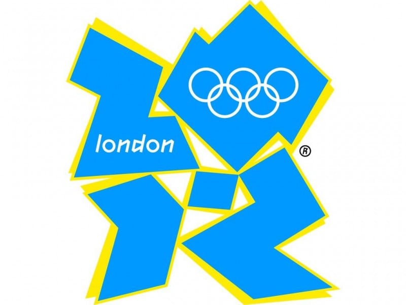
London 2012 Olympics – £400,000 (approx. $625,000)
Here it is – one of the most hated logo designs on the last decade. Designed by in 2007, the London 2012 Olympic logo is, according to the agency, “unconventionally bold, deliberately spirited and unexpectedly dissonant, echoing London’s qualities of a modern, edgy city.” For many, the result is actually “the graphic equivalent of… dad dancing” (Alice Rawsthorn in The New York Times) and a terrible attempt at creating something trendy. Criticism also rained in for the resemblance of the logo of Lisa Simpson doing something naughty and for secretly spelling the word “zion.”

Twitter – $2 – $6
Twitter managed to snag their original logo for the price of a sandwich, using the power of crowdsourcing to drive the price down and purchasing it from. Speaking about his creation, Japan-based designer Simon Oxley said he didn’t even realize Twitter was actually using the design until someone on their staff contacted him for permission to animate the bird. “I was happy to see the image ‘in-action’ as they say on iStockphoto, back when Twitter wasn’t well known. I did ask that a credit be added to the Twitter page mentioning that I had conceived the bird.” The design was recently updated by Twitter to a cleaner version.
Pepsi – $1,000,000
2008 re-branding was undertaken by the New York-based Arnell Group, who charged a cool $1 million USD for a complete branding package. That may seem like a lot, but it’s a drop in the ocean when you consider that the PepsiCo company poured $1.2 billion into changes on all the different beverage brands they own.
Accenture – $100,000,000
The pure simplicity of the logo, compared to the $100 million USD they paid for it, might make it the most surprising of the logos in this selection. Designed by Landor Associates in 2000, the only real “design” element on the logo is the angled bracket above the letter “t”, which signifies forward movement by the company into the future. The lowercase text has been used to signify a certain openness and friendliness, showing the company to be approachable and accessible.
BBC – £1,150,000 (approx. $1,800,000)
When the began to move towards the Internet and digital television in 1997, influential British graphic designer decided it was time to address the logo situation, suggesting that something more uniform across all the channels and media was necessary. Until then, the BBC had a branding system that meant each department had a different logo scheme, weakening the broadcasting company’s core brand severely.
The previous logo, with slanted boxes and colored dashes, caused pixelation problems on a computer screen and also proved costly to print as a four-colour letterhead on all the BBC stationary. To fix this, Lambie-Nairn simply straightened up the boxes, removed the dashes, and changed the font to Gill Sans – a typeface which had been invented 60 years ago, meaning there were no worries of it quickly looking outdated. The logo has not been changed since and will soon become the longest used design by the BBC
