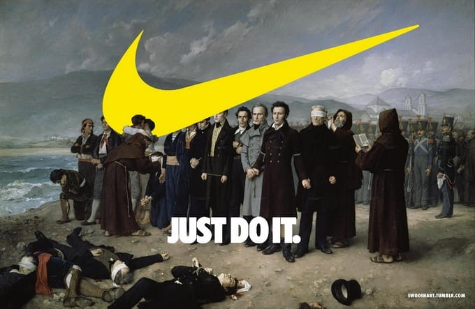
The swoosh is Nike’s curved brand mark, a simple check-like symbol that identifies the athletic footwear and apparel company. Designed in 1971, it began as a functional logo for a new sports brand and grew into one of the most recognisable symbols in global commerce.
- Created in 1971 for Blue Ribbon Sports, the company that later became Nike.
- Designed by Portland State University student Carolyn Davidson.
- The form suggests motion, speed, and a wing-like arc without showing a literal shoe or athlete.
- It became central to Nike’s visual identity across shoes, clothing, advertising, and product collaborations.
- Its value lies in instant recognition: the mark often appears without the company name.
Where did the swoosh come from?
The swoosh was designed by Carolyn Davidson, then a graphic design student at Portland State University, for Blue Ribbon Sports, Nike’s original name. Phil Knight, one of the company’s founders, wanted a logo for a new line of running shoes and paid Davidson a small fee for the work. The result was a stripped-back mark that could be printed, stitched, embossed, and scaled across many kinds of products.
The shape is often described as a wing or a tick, but its power comes from ambiguity. It does not illustrate a shoe, a runner, or even a letter in any obvious way. Instead, it acts as a sign of movement and forward drive, which made it useful for a company built around sport and performance.
Why does it matter in design?
The swoosh matters because it shows how a simple mark can carry a large brand system. In graphic design, a strong logo has to work at many sizes, in one colour or several, on a screen, on packaging, on fabric labels, and on objects that get worn and handled. The swoosh does this with very little structure: one sweeping stroke, a slight taper, and a sense of directional energy.
Its success also changed expectations for corporate identity. Nike did not rely on ornate typography or a detailed emblem. It built recognition through repetition, placement, and use on products that were already associated with athletic ambition. The logo became inseparable from the brand’s products, especially shoes, where it appears as a moulded patch, embroidered mark, printed transfer, or cut-out detail.
What does it look like in practice?
In practice, the swoosh can appear alone or alongside the Nike wordmark. On footwear, it often sits on the side of a shoe in a contrasting colour, where the curve complements the silhouette of the upper and midsole. On apparel, it is frequently reduced to a small chest mark, sleeve detail, or hem tag, where its size signals brand recognition without overwhelming the garment.
Because the mark is so compact, manufacturers can adapt it to many production methods. It can be screen-printed on cotton, heat-transferred onto synthetic textiles, embroidered onto caps, debossed into leather, or injected into plastic accessories. That flexibility helped it spread across product categories far beyond shoes, from sportswear to lifestyle goods and collaborations with artists, designers, and other brands.
How has it stayed so recognisable?
The swoosh has stayed recognisable because Nike used it relentlessly and consistently. The form has barely changed, but the context around it has shifted: marketing campaigns, athlete endorsements, limited-edition releases, and partnerships with designers have kept it visible in new settings. The logo now works both as corporate identity and as a cultural shorthand for sport, performance, and status.
Its longevity also comes from restraint. Unlike many brand marks that depend on illustration or detail, the swoosh can survive resizing, cropping, and reproduction errors without losing its identity. That makes it especially suited to contemporary visual culture, where logos are often seen quickly, at small scale, and on moving screens as well as physical goods.
Frequently Asked Questions
Who designed the swoosh?
Carolyn Davidson designed the swoosh in 1971 while she was a graphic design student. She created it for Blue Ribbon Sports, which later became Nike. The work began as a paid freelance assignment, not as a famous commission from a major agency.
What does the swoosh symbolise?
The swoosh suggests motion, speed, and momentum. It also carries a wing-like association, which fits a sports brand built around athletic performance. Nike has used that ambiguity to its advantage, because the mark can mean many things without needing to show them literally.
Why is the swoosh so famous?
It became famous because Nike attached it to products, athletes, and advertising with unusual consistency. The form is simple enough to survive almost any application, from shoe panels to printed packaging. Over time, that repetition made the symbol instantly readable even without the Nike name.
Articles mentioning Swoosh