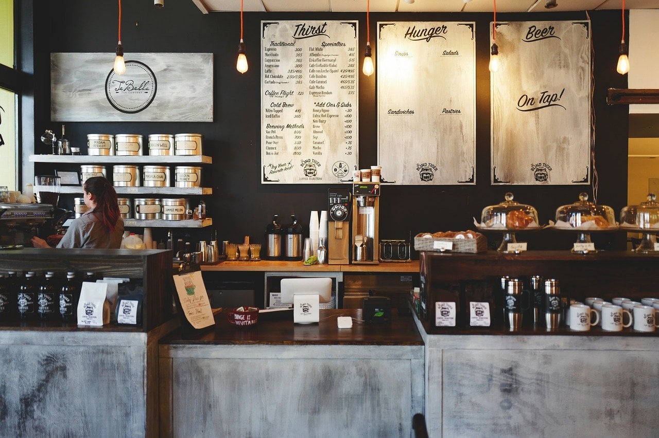
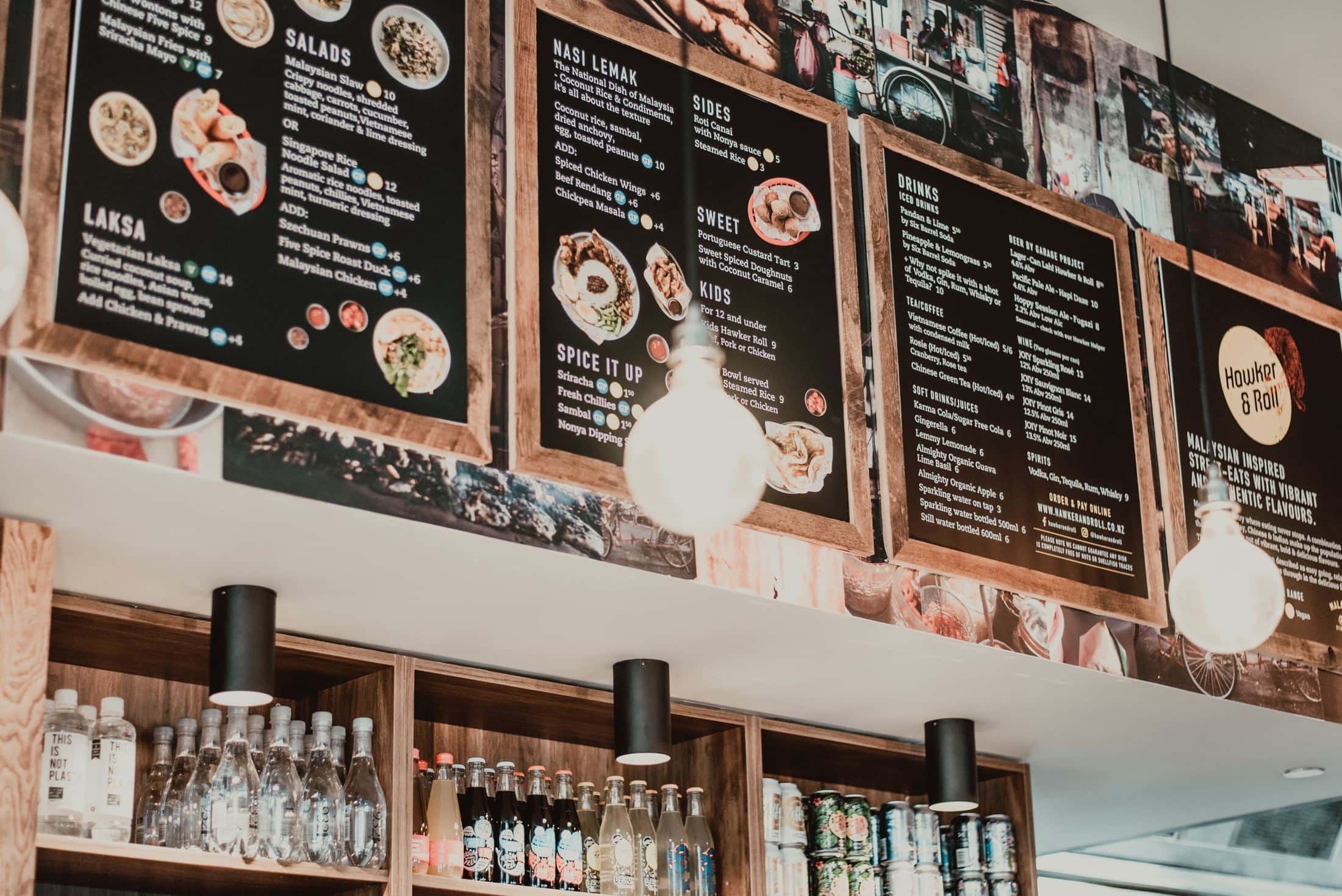
Digital menu boards are increasingly becoming a popular choice in many sectors such as restaurants, cafes, and cafeterias. They are appealing, eye-catching, and highly welcoming, and they are also an important aspect of the outlet’s identity because they are easily recognizable. They improve the attractiveness of the menu items, increasing sales.
However, to obtain the most value and return from digital menu boards, you must ensure that the style and design are perfect. Here are a few pointers to help you get the most out of your digital menu boards:
Maintain Balance
Maintain a clear mindset so that customers can quickly see what’s offered. Your goal is for your clients to read through the entire menu. So keep things balanced throughout the menu area. Menu items’ wording should be easy to read so that customers can quickly see what’s available. To ensure that your customer examines the full menu, keep a balance between visuals, and text.

Saturation and Contrast
Reading is tough with the heavy, vivid backdrop colors and colored lettering. It should be simple to read the menu options. For the backdrop and text, use colors that contrast nicely.
The trick is to choose a color scheme that contrasts with the wall on which the menu board is mounted. For example, a black screen against a white wall might be a terrific way to draw attention.
Use Video & Movement
Humans have a natural tendency to get attracted to movement. It has been noted that video content can increase the return on investment. Cinemograph is a popular advertising technique in which one movement parallaxes against a fully static screen. Using a cinemograph to display an animated cup of coffee next to its price is a terrific way to use a cinemograph to draw attention to the coffee rather than the price.
Stay true to your brand
Your digital menu boards should mirror your company’s image. Consider the colors, fonts, and artwork you use across your physical location and incorporate them into your digital menus. Remember the fundamentals of good design: don’t overcrowd your design and provide enough room for your content. It will make it easier to read your menu boards.

Place high-margin products on the right side of the menu
Customers do not read digital menu boards in the same way that they would read a book. Most people, with a few exceptions, start at the right-hand side of the menu, scan left and down, and then return to the right to see if they missed anything. This indicates that putting your high-margin products where they’ll get the most attention pays off. Other low-margin goods or those you know will sell regardless, can be placed in various locations on the board.
