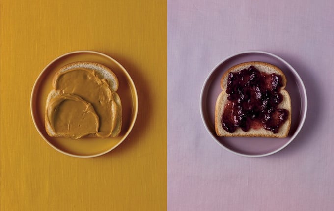
Beth Galton is a New York-based food and still life photographer known for tightly composed, studio-made images that turn everyday ingredients and packaged products into polished commercial pictures. Her work sits at the point where advertising, editorial photography, and tabletop styling meet, with careful control of light, color, texture, and arrangement doing most of the visual work.
- She works primarily in food photography and still life, often for advertising, magazines, and packaging.
- Her images are built around precise lighting and composition rather than dramatic set pieces.
- She has photographed campaigns and packaging imagery for major consumer brands.
- Her pictures have appeared in publications such as The Washington Post, Saveur, and Rachel Ray.
- She is especially associated with clean, studio-based food imagery, including the “Cut Food” series.
What does Beth Galton photograph?
Galton photographs food, packaged goods, and still life subjects, usually in a studio setting where every element can be controlled. That means the subject, props, surface, light, shadow, and color palette are all chosen to support a clear commercial image. In this kind of work, the food is not just documented; it is staged so it reads crisply, attractively, and with a specific brand tone.
Her portfolio spans editorial and advertising commissions. She has made imagery for brands such as Denny’s, Chipotle, Burt’s Bees, Starbucks, Mott’s, Gerber, Bath & Body Works, and St. Ives, which shows the range of food and consumer products that can fall under her practice. The same visual discipline also makes her work useful for magazines and packaging, where the image has to communicate quickly and cleanly.
Why is her work notable?
Galton’s reputation rests on craft. Food photography depends on timing, but it also depends on control: the right surface sheen, a useful angle, enough detail to make texture feel real, and enough restraint to keep the image from becoming cluttered. Her pictures are known for their attention to these details, along with a strong command of light and composition.
That matters because food photography often has to do several jobs at once. It must make the product desirable, fit a brand’s visual language, and still look convincing to a reader who can inspect it closely. Galton’s images tend to do this with clarity rather than spectacle, which is one reason they work across magazines, campaigns, and packaging.
What is the “Cut Food” series?
The “Cut Food” series is one of Galton’s best-known bodies of work. It presents ordinary foods sliced open to reveal their interiors in cross-section, creating images that are both straightforward and slightly uncanny. A sandwich, cake, egg, or piece of fruit becomes an object of pattern, structure, and texture as much as appetite.
That series shows how still life photography can shift a familiar subject into something more analytical. The cut surface exposes layers, fillings, and internal forms that are usually hidden, and the studio treatment turns those details into a graphic composition. The result is less about cooking than about seeing how food is built.
How does her studio method shape the image?
In commercial food photography, the studio is a production space as much as a picture-making space. Galton’s work depends on the exact placement of food, props, and lighting so the subject reads clearly and looks intentional. Small choices, such as the angle of a slice or the reflectivity of a plate, can change the entire image.
This method also explains why her pictures are so adaptable to different clients. A fast-food chain, a natural-products brand, and a magazine all need different signals from the same subject matter, but studio photography can be tuned to each brief. Galton’s strength lies in making those adjustments without losing a consistent visual standard.
Frequently Asked Questions
Is Beth Galton mainly an editorial or advertising photographer?
She works in both fields. Her client list includes major advertising and packaging assignments, but her images have also appeared in magazines and newspapers. The overlap is common in food photography, where a well-made studio image can move easily between editorial use and commercial promotion.
What makes food photography different from other still life photography?
Food photography has to balance visual appeal with realism. The subject can wilt, dry out, melt, or change color during a shoot, so timing and preparation matter as much as composition. In Galton’s work, those pressures are handled through precise lighting and careful staging, which keep the image fresh and legible.
Why is the “Cut Food” series often mentioned?
It is memorable because it turns familiar food into a visual study of structure. The sliced interiors create patterns that are simple to understand but satisfying to examine, which makes the series easy to remember and widely reproduced. It also captures a central idea in still life: ordinary objects can become formal images when seen with control and precision.
Articles mentioning Beth Galton