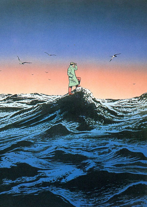
Guy Billout is a French illustrator known for spare, precise images that often introduce a quiet twist of irony or surreal dislocation. His drawings and editorial illustrations use clean lines, controlled composition, and a restrained palette to make an image feel calm at first glance, then slightly unsettling on closer reading.
- Born: 1941, Decize, France
- Trained in: art studies in Beaune, France
- Moved to New York: 1969
- Known for: editorial illustration, book illustration, and visual irony
- Notable venues: New York Magazine, The Atlantic Monthly, and illustrated children’s books
What makes Guy Billout’s work distinctive?
Billout’s illustrations are built from economy rather than abundance. He tends to strip away decorative noise, leaving clear silhouettes, neat spatial relationships, and a scene that reads quickly. That restraint gives his images their force: the composition seems rational and controlled until a small contradiction, improbable object, or wrong-footed gesture appears.
The result is a form of visual wit that sits close to surrealism but does not rely on dream logic alone. Billout often makes ordinary settings feel slightly off by shifting scale, context, or expectation. A street, a room, a landscape, or a domestic object may remain recognisable while the image’s internal logic tilts into ambiguity.
How did his career develop?
Born in Decize in 1941, Billout trained in Beaune and worked in advertising before moving to New York in 1969. That move placed him in a publishing and magazine culture that valued strong conceptual illustration, especially images that could carry an idea without heavy explanation. His breakthrough came when his work was published in New York Magazine.
From there, he built a career across magazines and books, including work for The Atlantic Monthly and a number of illustrated volumes. He also illustrated books on Greek mythology and children’s books, showing that his style could support both literary subjects and more accessible narratives. Awards followed, including recognition from the Hamilton King competition and repeated mention among The New York Times ten best-illustrated children’s books.
What does his illustration process look like on the page?
Billout’s pages usually depend on clarity of drawing and exact placement. Figures and objects are simplified but not schematic; they retain enough detail to feel physical, yet they are never overloaded with texture. The surfaces are smooth, the colours are often subdued, and the image space is carefully organised so that the viewer’s eye moves in a deliberate path.
That control matters because the joke or surprise in a Billout illustration is often structural. He does not announce the twist with exaggeration. Instead, he sets up an image that appears stable, then introduces a detail that changes how the entire scene is read. This technique makes his illustrations useful for editorial work, where an image must communicate quickly but still reward a second look.
Why does Guy Billout matter?
Billout represents a strain of late twentieth-century illustration that trusted understatement. At a time when illustration could lean toward either polished realism or overt caricature, he developed a language of restraint, precision, and controlled oddness. That balance made his work memorable in magazines, where a single image had to hold attention on a crowded page.
His influence lies partly in showing that minimal means can produce strong narrative effect. By keeping the drawing clean and the idea compact, he demonstrated how illustration can be intellectually sharp without becoming visually loud. For readers and designers, that is a useful model: the image does not need to say everything, but it does need to land exactly.
Frequently Asked Questions
Is Guy Billout a surrealist?
His work is often described that way because it places ordinary scenes under subtle pressure and allows impossible or unexpected details to appear. But his images are usually more controlled than classical surrealism, with a stronger emphasis on clarity, composition, and dry humour. He is better understood as an illustrator who uses surreal effects within a disciplined visual language.
What kinds of publications used his work?
Billout’s illustrations appeared in magazines such as New York Magazine and The Atlantic Monthly. He also produced book illustrations, including children’s books and a collection connected to Greek mythology. That range shows how adaptable his style is across editorial, literary, and educational formats.
What should be noticed first in a Billout illustration?
The first thing is usually the economy of the image: clean drawing, sparse detail, and a calm arrangement of forms. After that comes the disruption, which may be small but changes the meaning of the whole scene. The best way to read his work is to look for the exact point where ordinary observation turns strange.
Articles mentioning Guy Billout