
John Holcroft is an illustrator and graphic designer from Sheffield. His work here shows a consistent retro look built from flat colour, simplified figures, and the visual language of mid-century advertising.
Satire built from familiar objects
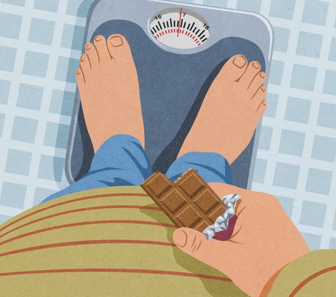
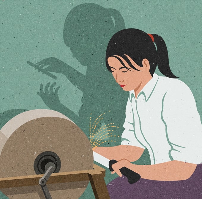
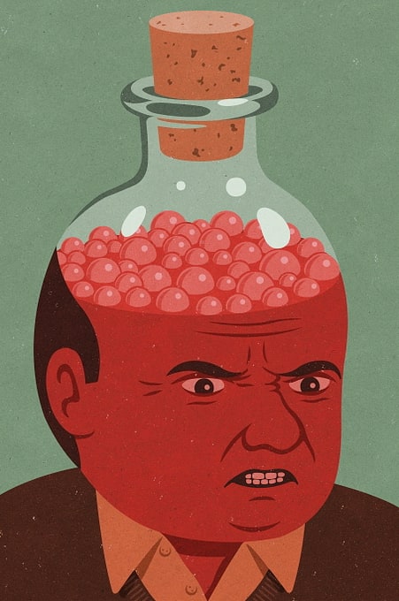
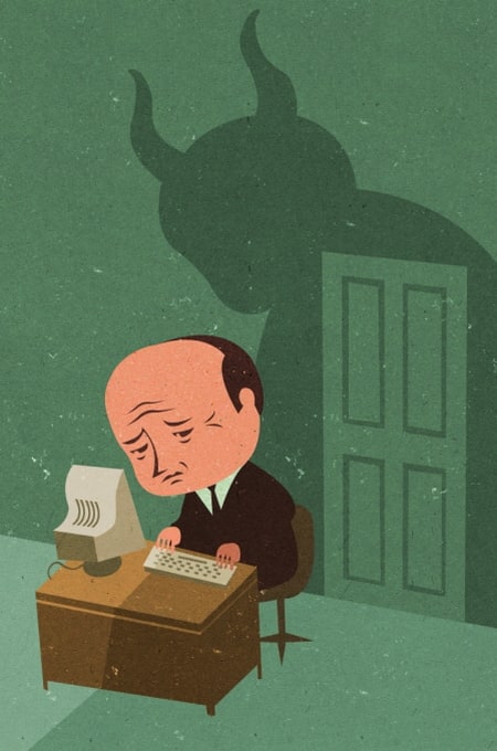
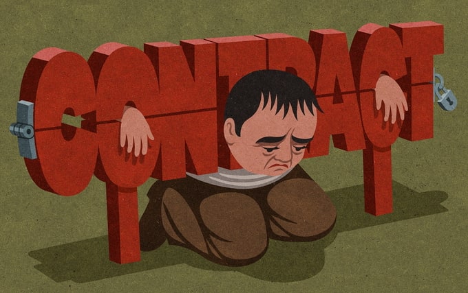
The images turn ordinary objects into blunt visual jokes. A bathroom scale frames bare feet and a chocolate bar; a pig marked “BANK” carries a cluster of office workers; a toothbrush is paired with a tube of toothpaste that resembles a rolled-up bill. Elsewhere, a man sits under a desk with the word “CONTRACT” stretched across him, and another figure crouches beside a game controller against a red background while blue roots spread below. The set also includes a man with a computer and a dark shadow behind him, a head filled with red liquid, and a seated figure trapped behind the outline of a head made of bars.
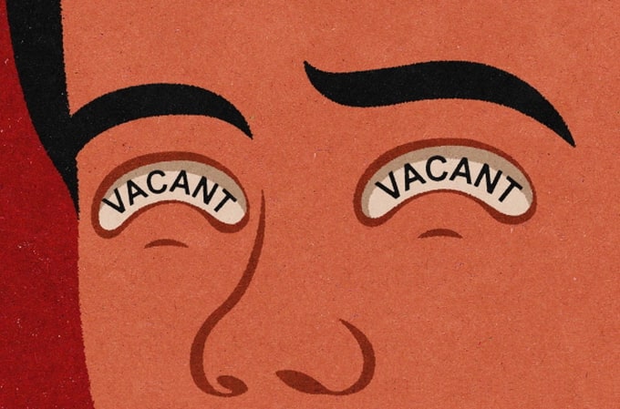
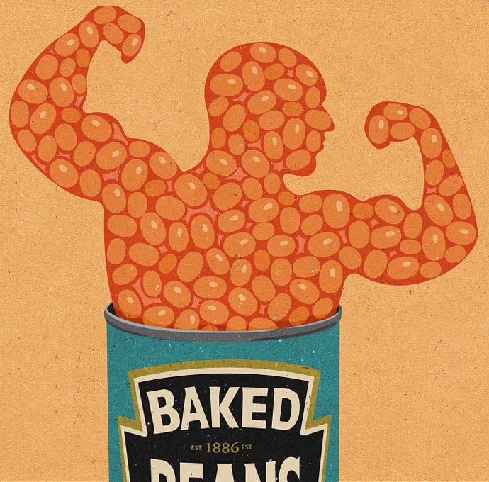
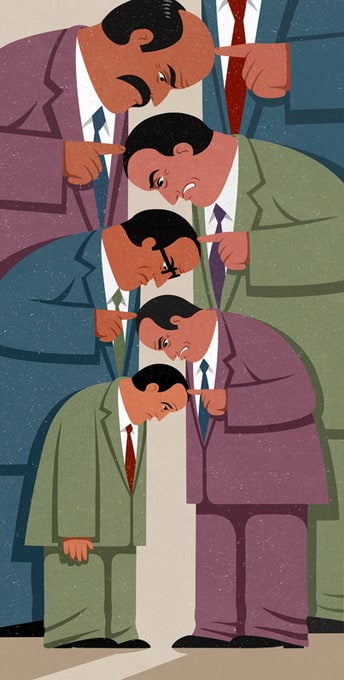
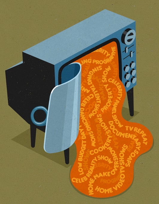
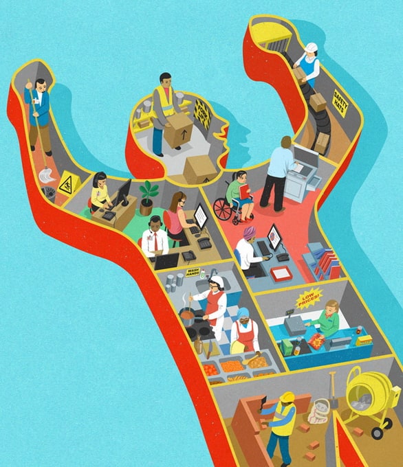
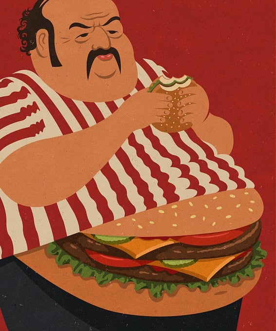
Across the gallery, Holcroft uses strong blocks of colour, hard-edged silhouettes, and compact compositions. Many scenes are arranged around a single central figure or object, with empty backgrounds that keep attention on the visual punch line. Several works use shadow or outline to add a second image behind the main figure, as in the woman at a machine, the office worker beneath the “CONTRACT,” and the head-shaped cage. The palette stays controlled: muted greens, reds, blues, browns, and creams recur across the set, giving the images a unified look even when the subject changes.
A style based on old advertising
The existing text says Holcroft’s style is based on advertisements from the 1950s, and the images match that description closely. They echo the look of printed poster art through their clean shapes, limited colours, and deliberately aged surface. That vintage finish is visible in the grainy texture and slightly worn fields of colour, which make the illustrations feel like they have been pulled from old packaging or an archive of commercial graphics.
The subjects, however, are not nostalgic. The drawings focus on modern behaviour and social pressures through simple, recognisable symbols: money, work, consumption, technology, and constraint. A curled banknote forms a tube beside a toothbrush, a worker is crushed beneath the word “CONTRACT,” and a hand holds a game controller while roots extend below the ground. The drawings use the stripped-down clarity of advertising to present those themes in a direct and compressed way.
Published work and visible concerns
The current text lists the BBC, Reader’s Digest, Financial Times, The Guardian, and The Economist among Holcroft’s portfolio. It also says his drawings spread quickly online. That wider context sits alongside the work shown here, which keeps to a compact format and relies on immediate recognition.
Across the set, the same visual habits repeat: one image per idea, strong contrast, and a satirical twist anchored in everyday imagery. A man slumps in a wheelchair-like chair with exposed roots beneath it; a glass bottle contains a red-faced head; a group of people are packed into the body of a pink pig. Each picture is easy to read at a glance, but each also piles one object, symbol, or gesture on top of another to create a sharper, stranger scene.