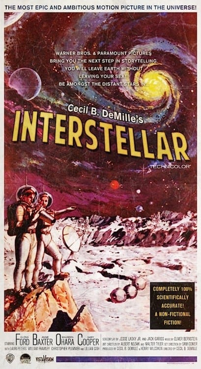
Peter Stults is a designer and illustrator known for poster-style images that reimagine modern films as if they had been made in earlier eras, from silent cinema to mid-century studio publicity. His work sits between graphic design, film history, and pop illustration, using period typography, fabricated billing blocks, vintage color palettes, and aged paper effects to make new movies look like archival artifacts.
| Field | Graphic design, illustration, visual culture |
|---|---|
| Known for | Alternative movie posters and “what if” re-imaginings of films in past eras |
| Working method | Digital illustration, layout design, typographic pastiche, historical reference research |
| Style markers | Old-style typefaces, distressed textures, theatrical composition, retro studio branding |
| Why it matters | Shows how historical design languages can be reused to change the meaning of contemporary images |
What Peter Stults makes
Stults makes illustrated film posters that ask a simple question: what would a recent movie look like if it had been released in another decade? The answer is built through design rather than narrative. A science-fiction blockbuster might be redrawn as a 1950s roadshow poster, while a comedy may appear as a black-and-white one-sheet with hand-lettered credits and a star’s face placed in a carefully staged composition.
These images are not just nostalgic jokes. They rely on a close reading of poster history, including how studios once used face-based layouts, painted key art, decorative borders, and dense credit blocks to sell films. Stults uses those conventions as a design vocabulary, then applies them to contemporary titles so the result feels both familiar and slightly uncanny.
Where does his style come from?
Stults’s work draws on the long history of movie advertising, especially the era before photographic key art became standard. Early and mid-20th-century posters often depended on illustration, dramatic lettering, and condensed visual storytelling. They had to communicate genre, mood, and star power at a glance, and they did so with strong graphic hierarchy and a clear sense of theatricality.
His pieces also borrow from collecting culture. The surfaces often look aged, as if they have spent decades folded in a lobby drawer or framed in a basement archive. That weathered look matters because it helps the viewer suspend disbelief. The poster is not simply “old-style”; it appears to have lived through history, which makes the fantasy of alternate time periods more convincing.
Why does this work matter?
Stults’s posters show how design can rewrite cultural memory. A movie we know as contemporary becomes, for a moment, part of an older visual system with different assumptions about celebrity, spectacle, and taste. That shift exposes how much of cinema’s identity comes from packaging rather than the film image alone.
His work also belongs to a larger practice of speculative design in illustration: taking an existing object and recasting it through a different historical lens. In Stults’s case, the process is especially effective because movie posters already sit at the boundary between commercial design and art. His images make that boundary visible by treating publicity material as something that can be authored, researched, and reimagined with as much care as the film itself.
What does his process look like in practice?
Making one of these posters usually means starting with the film’s core identity: genre, lead characters, mood, and the visual clichés attached to its period of origin. From there, the design is translated into another era’s language. That can involve choosing a type style that matches the target decade, roughening the image surface, simplifying color, and arranging figures in a composition that feels borrowed from a specific historical poster tradition.
The results depend on controlled imitation. Good pastiche needs accuracy in the small things: the shape of the title treatment, the placement of the credits, the scale of the actors’ names, and the relationship between image and copy. Stults’s success lies in making those details feel effortless, so the poster reads immediately as a design object rather than as a simple novelty graphic.
Frequently Asked Questions
Is Peter Stults a film director or a poster artist?
Peter Stults is known for poster and illustration work, not for directing films. His name appears in connection with visual reimaginings of movies, where the main work is done through composition, typography, and graphic style. The films are the subject; the posters are the medium.
Are his posters official movie marketing materials?
No. They are concept works and personal reinterpretations, made to imagine how films might have been marketed in a different time or place. That separation matters, because the appeal comes from the freedom to use history as a design tool rather than as a studio brief.
Why do his images feel so convincing?
They feel convincing because they are built from real poster history instead of generic retro styling. Stults pays attention to the visual habits of specific eras, including typography, layout, color, and aging effects. The result looks like a recovered artifact because it follows the logic of one.
Articles mentioning Peter Stults