Just as everyone has a little interior design guru inside, everyone who works with design, imaging, or writing, has a bit of a font geek lurking in their soul, too.
Spend more than a few hours per week sitting at your desk, lining up letter after letter and word after word, and you soon start to form some pretty fundamental opinions about the shape and look of the fonts you choose – and the surroundings in which you earn a living.
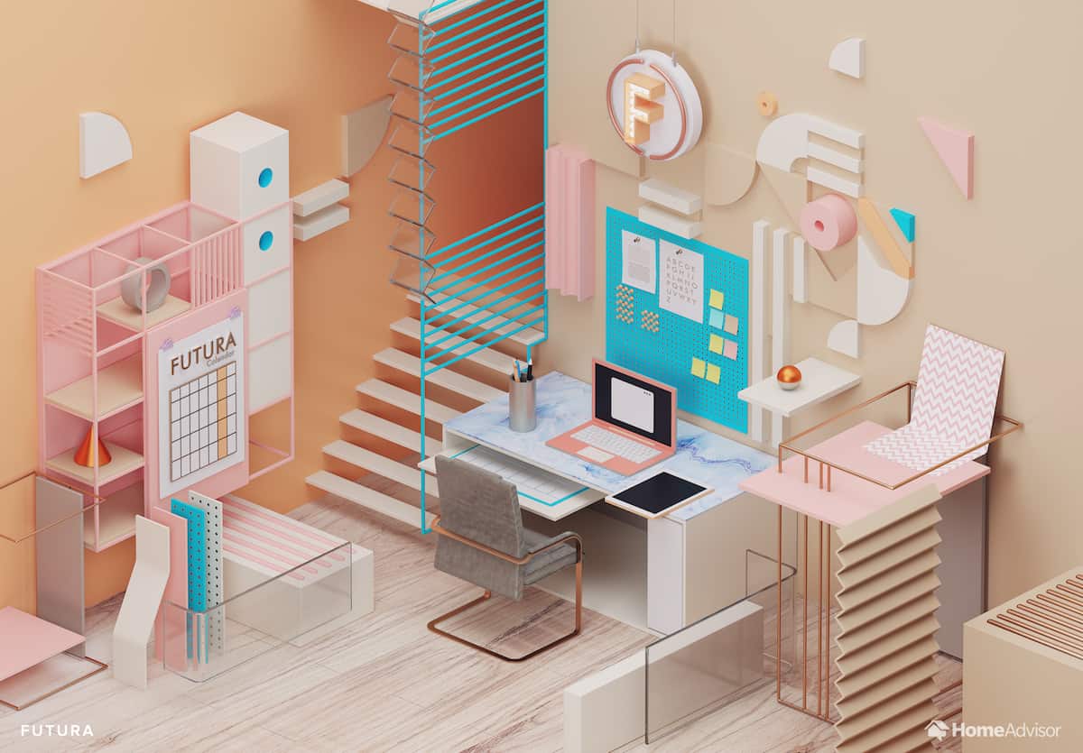
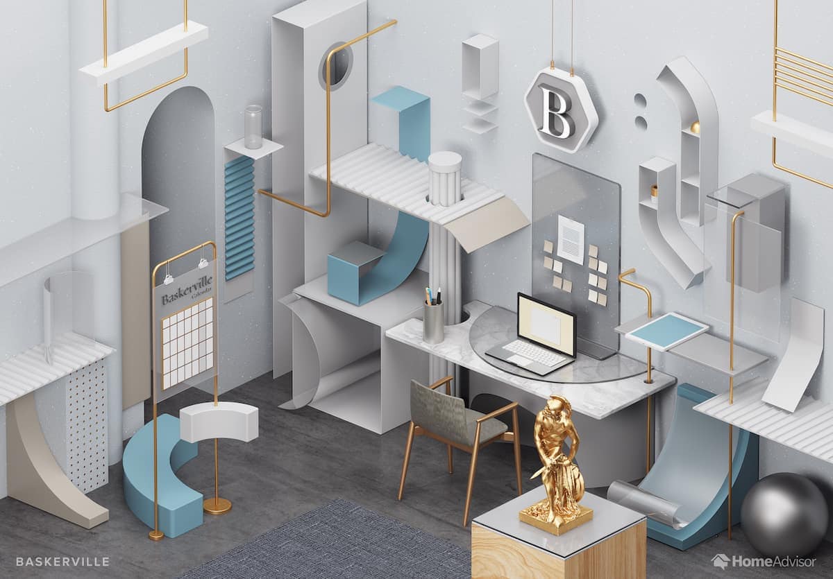
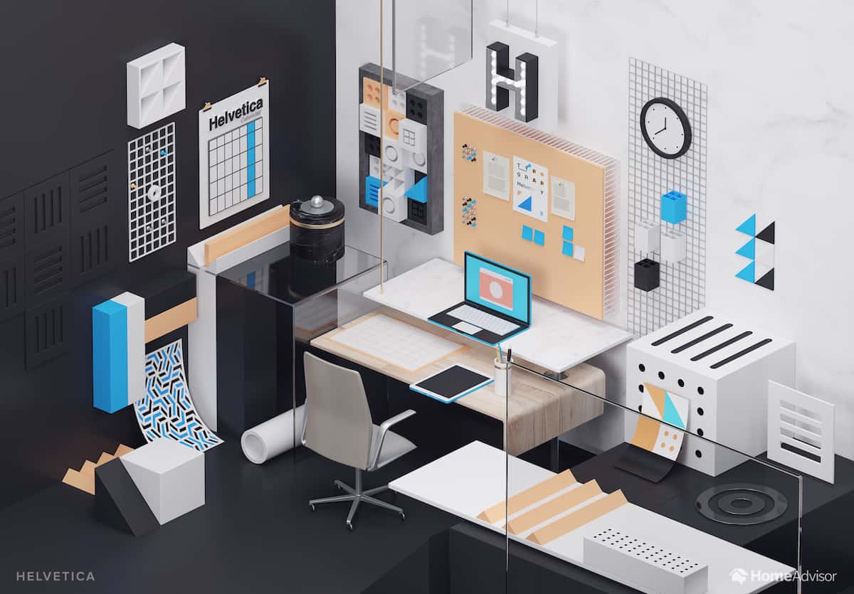
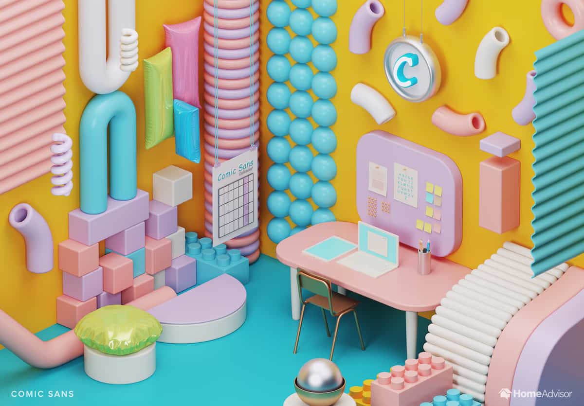
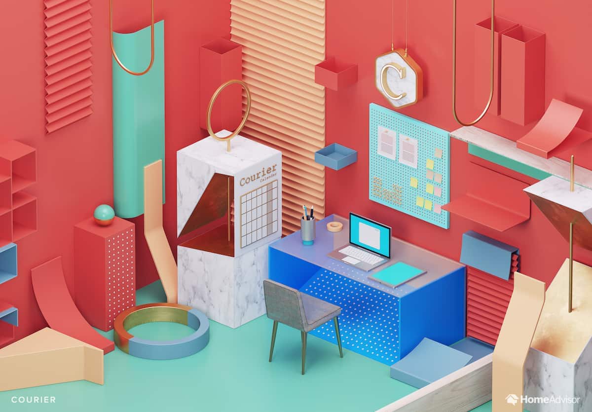
It’s only natural then, that somebody would finally put the two together and create a guide to re-designing your office based on your favorite font. In fact, these 3D renderings from HomeAdvisor transform seven popular fonts into stylish study spaces. From the gravity of Baskerville to the levity of Comic Sans, each font pops up into a desirable 3D space to sit and work.
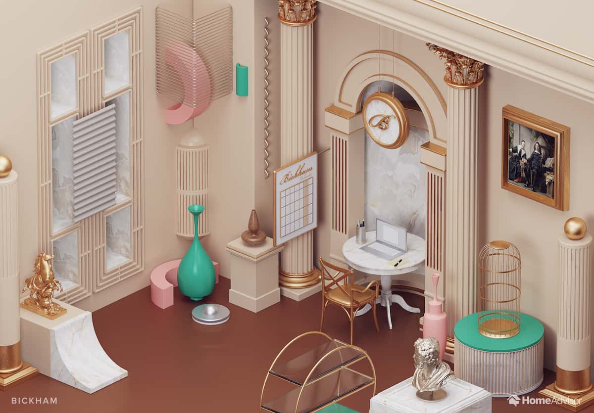
Even fusty old Bickham Script becomes a room to desire. You’ll recognize the typeface as the posh and loopy calligraphy-style font that appears on invitations, certificates, and bottles of wine. Re-imagined as an office space, Bickham becomes suitably kitsch: gold trim, Corinthian columns, and a gilded, empty birdcage.
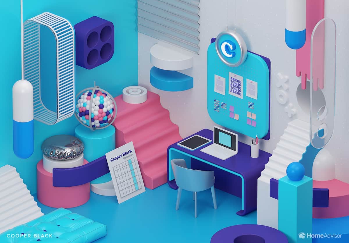
Cooper Black gets a slightly more modern makeover: the impactful serif typeface is firmly set in the 1970s. Those bulbous serifs (most famous, perhaps, from the Pet Sounds album cover) become a spherical motif to be repeated in ornaments and banister tops, the contours echoed in pharma-chic objets d’art and a rather comfy-looking padded writing chair.
So if you’re stuck for inspiration when it comes to redesigning your office, yet you’re determined to do-it-yourself, why not pick out your own favorite font and imagine what it would look like as a living, breathing study space?
FUTURA
BASKERVILLE
HELVETICA
COMIC SANS
BICKHAM SCRIPT
COURIER
COOPER BLACK
