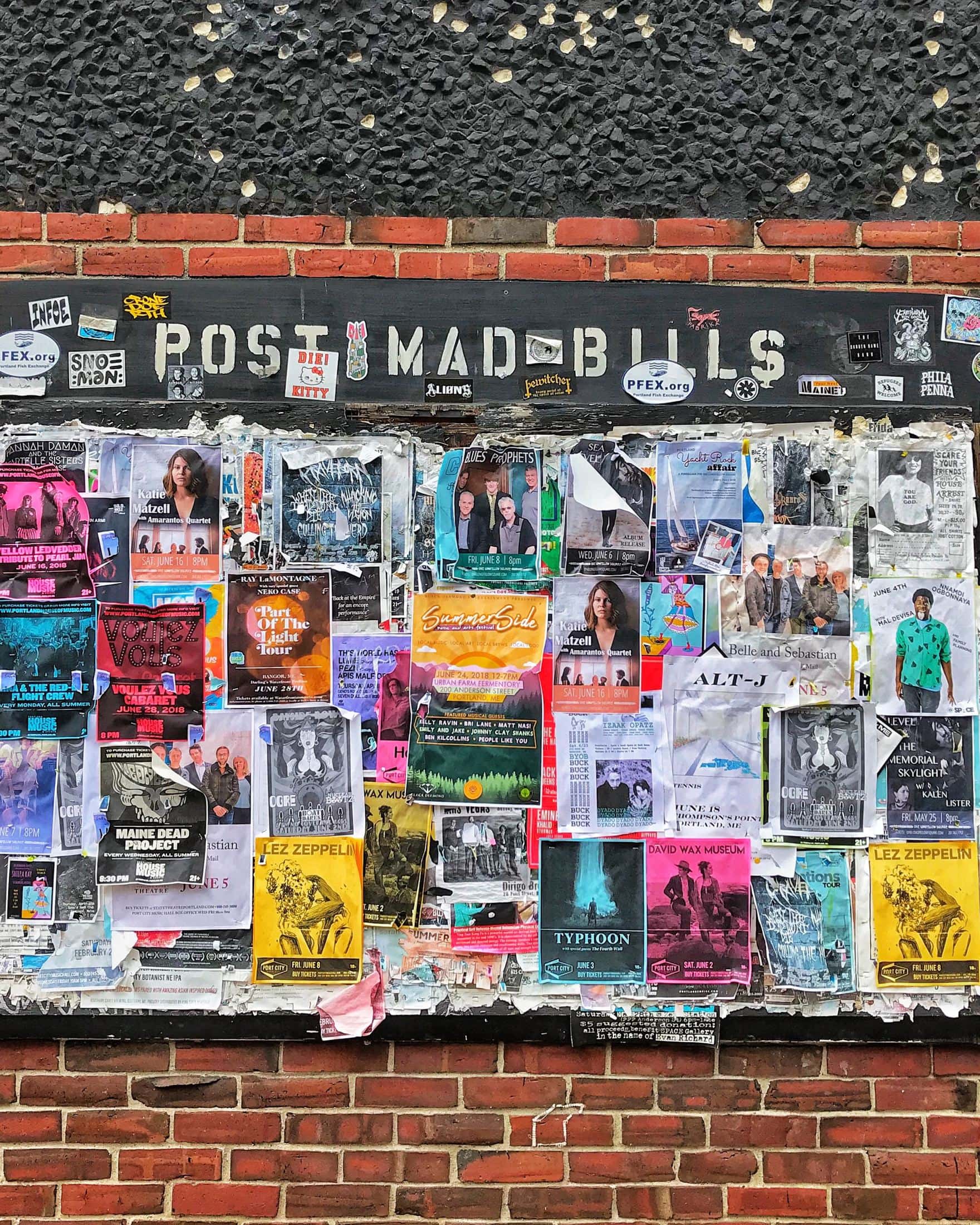
Towns and cities are covered in visual advertisements. From the big screens in New York’s Times Square and London’s Piccadilly Circus to the posters covering the walls of underground rail services, every inch of space has something on it.
So why do some posters and billboards work better than others? What makes a visual stick in your head so that you remember – and go out and buy -the product or brand you saw? As a company or artist, business person, or independent seller, you want to consider how to advertise your product or service carefully. Target audience, color choice, photography, graphics, how much information to put on the poster… all of these things play a huge part in making a successful advertisement.
Want to know more about getting the right look for your advert? Keep reading!
The Photo
Do you want something artsy? Do you want something digitally altered? Do you want something crisp and clean?
These are the questions you need to be asking yourself and your design team when it comes to building your advert. There are many and varied ways you can go about product photography or getting a digital artist to create something bespoke.
When creating the images, think about the message you want to portray. The phrase “a picture is worth a thousand words” comes to mind. Your images must tell the story of your brand or product and elicit emotion from the viewer.
For instance, if you are a serious injury lawyers firm, you don’t want an advert that looks like you host children’s birthdays. You want the audience to know that their issue will be taken seriously at your firm, and will need visuals to match.

The Colour
Colours can completely change how people see your branding. There are academic papers and blog posts on the psychological effects of colour.
When you started your business, you put your logo together. You probably want to keep in the same colour palette as that — people will associate your brand with those hues and the particular advertisement. If you want to make things eye-catching, use reds and oranges. If you want to feel more professional, use whites, blues, greys, and blacks.
Do your market research and try things out. Don’t be afraid to experiment with colour combinations and styles and to ask your audience for feedback on what works well to them.
The Text and Font
The type of advert you are creating will determine how much text you need. Some of the best adverts ever have used minimal text, or even none at all. The goal is to get your message across using images primarily and then as few words as possible.
Make sure that any text used is legible. There is nothing worse than an ad with a fancy font that is completely unreadable.
The second consideration is the size. If you want people to be drawn in, have bold text with an enticing message that pulls people closer. You can then have the rest of the information in small bite-size chunks so that people know who you are a what you do without being overloaded with unnecessary information.

To Conclude
Adverts plastered around a city – on billboards, in newspapers, or on the city centre walls – are one of the oldest ways to get your business’s name out into the world. It is a competitive market, so you need to stand out while also staying true to your brand. Do your research, make plans, and create multiple versions of your advert so that you have the greatest chance of success.
Creating an effective advert is like creating a work of art. It takes time!
