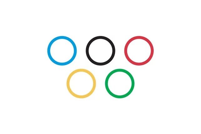
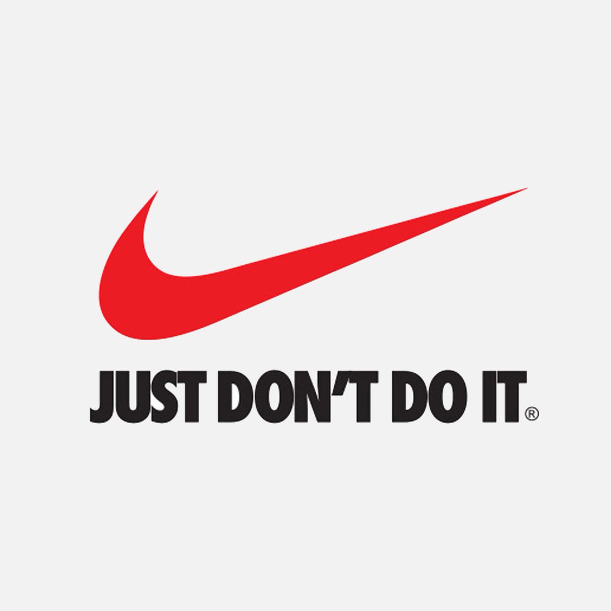
During this Covid-19 pandemic, there are a lot of o things and people who are trying to make us feel better but also educate about the importance of staying home and keeping the social distance. One of those people is Jure Tovrljan. He is a creative director from Slovenia, who did quite a change to logos of popular brands. He wanted to make them more appropriate for the coronavirus period. For example, The Mastercard circles and the Olympics rings are drawn now with safe (preferably 1m) space apart from each other.
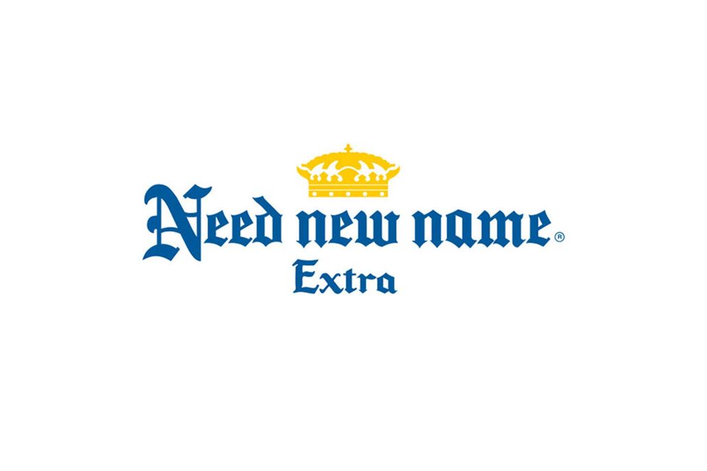
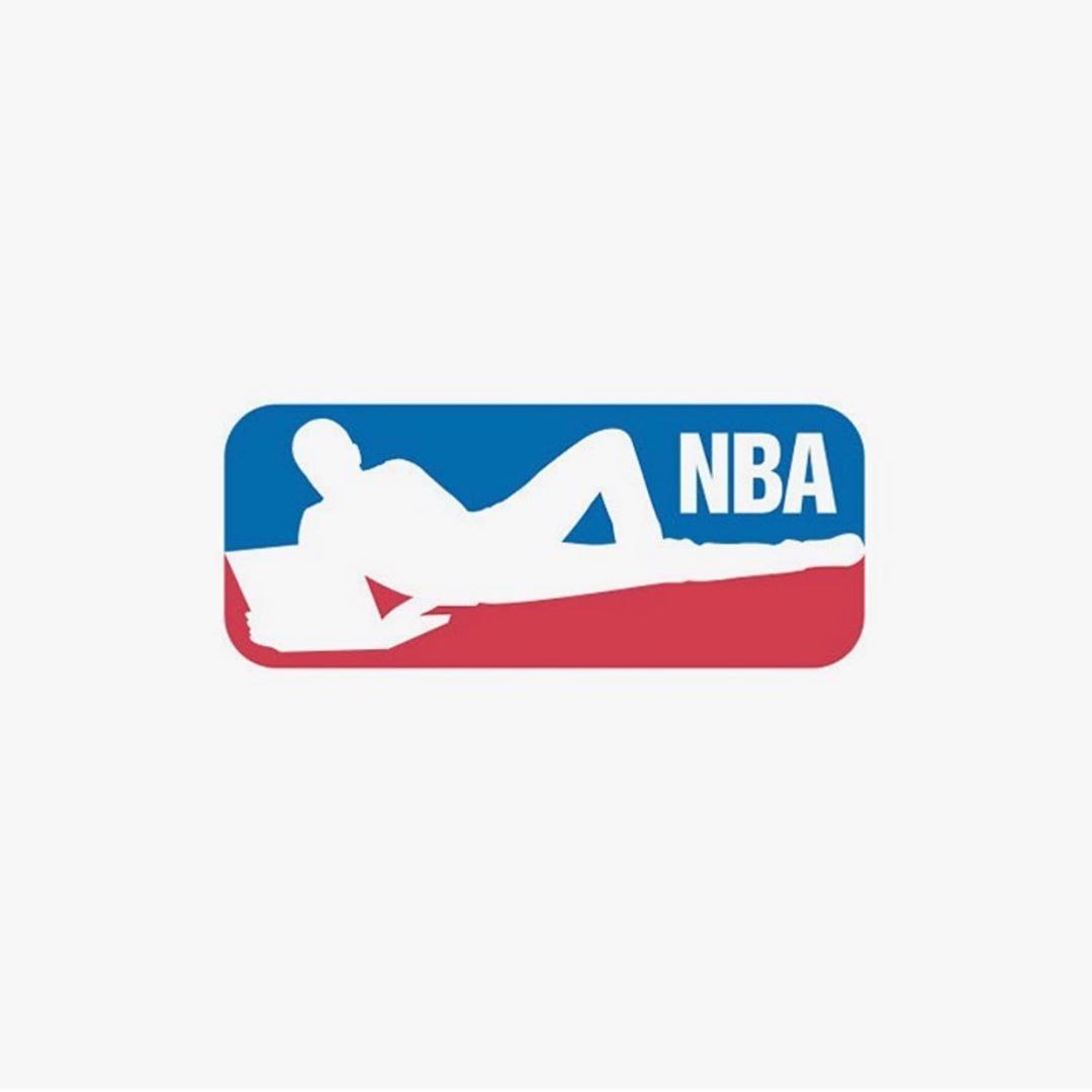
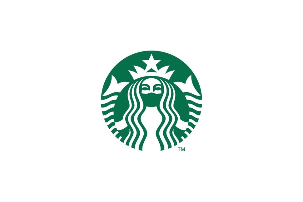
A very remarkable sentence from Nike’scompany is now rewritten as “Now Don’t Do It.” Starbucks‘s logo includes an extra protecting mask. On the NBA logo, Jerry West silhouette is now relaxing in front of a laptop, probably watching another season of a Drag Race on Netflix. And the most intriguing change is this one made on a Corona Extra’s beer. The symbol now reads, “Need a new name.” It’s hard to blame this idea. The company needs some good PR in the future. Jure Tovrljan tries to put awareness out there. On his sharing site, he always writes very inspirational quotes. About his new project, he wrote it very simply:
“Just an idea of how logos should look like in these difficult times. Hang in there, guys. Stay home.”
So check out his artwork and please, stay home.
