Starbucks has given marketers a branding lesson when its logo became one of the most recognizable in the world. It has reached brand recognition, kept consistency and ticked awareness in most of the countries it opened coffee shops. The Starbucks logo evolution includes some outstanding milestones you can learn from and considerations for your own business.
Why is the Starbucks logo so important? It has managed to turn marketing odds in its favor so much that it made product placement interactive all over the world. People have willingly adjusted to its coffee-to-go concept and they show it by sharing photos holding a Starbucks cup on social media. Even though who aren’t customers of Starbucks have an opinion about the brand and initiate discussions.

There was a Beginning to Starbucks
Having about 47 years of existence, it might seem surreal that Starbucks was founded as a small coffee shop in Seattle which no one thought it would become an international chain. It came with a complex and detailed logo featuring a topless mermaid on a brown background. If you investigate the Starbucks logo history, as presented on LogoRealm, you will notice that each visual update was made to streamline the logo and increase brand recognition.
Three entrepreneurs wanted to connect their small coffee shop to the nautical heritage of Seattle. Their sole purpose was to pay a tribute to their town. Gordon Bowker, Jerry Baldwin, and Zev Siegl researched in a book with old marine woodcuts and came up with a two-tailored mermaid wearing a star crown. The logo was supposed to look as seductive as coffee and it did.
The Starbucks name was inspired by a character featured in the Moby Dick book. Founders first intended to name their coffeehouse Pequod, after a whaleship. Many are probably happy they changed their name on time and chose a more appealing version. Founders wanted to open a coffee shop which imported, roasted and sold fine coffee beans. The building which hosted the first Starbucks coffee shop was demolished in 1974. However, owners quickly opened a new one on 102 Pike Street, Seattle, WA. This coffee shop is still open and stands in public memory as the original location of Starbucks coffee shop.
Starbuck’s First Logo Change
Starbucks had its first logo adjustment in 1987 when it started to sell espresso beverages. The brand was also acquired by Howard Schultz at the time, who decided to lose the rich brown tone in favor of a green friendlier version. The new shade would represent growth, uniqueness, prosperity, and freshness.
The company name was featured inside a two-star circle. Starbucks also shortened its name, along with the acquisition and became Starbucks Coffee. This was the first brand polish in the history of this coffee chain.
Howard Schultz owned Il Giornale at the time and had growth plans for the Italian culture brand. However, he decided to focus on the coffee shop which had higher growth potential for the public and turned to Starbucks. Schultz had created Il Giornale as a response, after a few failed attempts to convince Starbucks owners to add espresso beverages to their menu.
Starbucks Aligned to the `90 Era
Starbucks became publicly traded in 1992 and reconsidered its branding identity again. The brand would become more family-oriented, so the lower part of the mermaid was removed. Also, graphic designer Terry Heckler was hired to revise the logo. The refreshed image represents the basis of what we know today as the iconic Starbucks muse. At the time, the mermaid was white, on a black background.
The Starbucks brand began to earn international fame, so its creative team had to grow. However, brand managers decided to keep the Freight Sans Black font on the logo because it was simple, thick and had friendly rounded letters. It would compensate for the complexity of the mermaid image.
The Starbucks cup began to have cameo appearances in films such as Sex and the City (1998) and continued with The Devil Wears Prada (2006). Both initiatives had the purpose to show the coffee cup as stylish.
The Peak of the Starbucks Logo Evolution
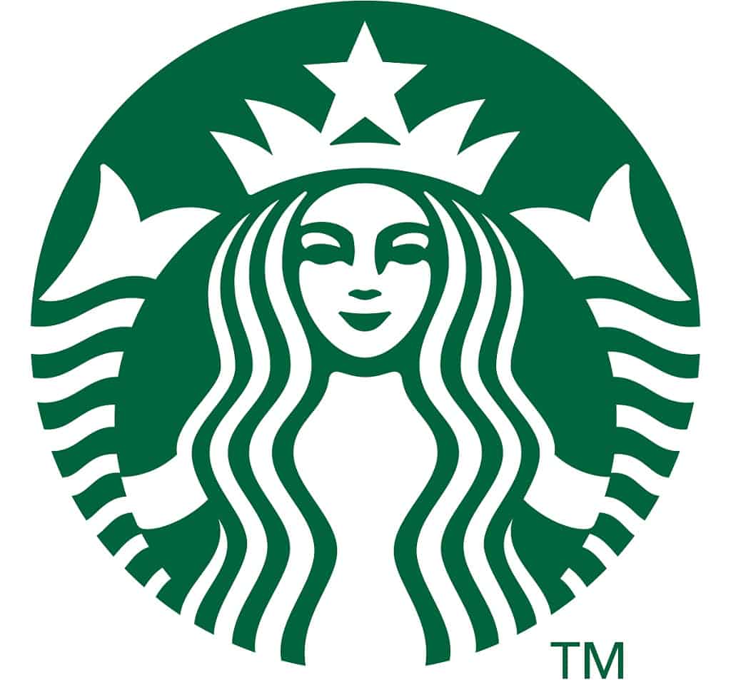
The last and latest change to the Starbucks logo took place in 2011 when the branding team acknowledged that the name was no longer necessary. Therefore, the logo lost its text, stars and excess colors. The Starbucks logo now only features a white and green circle with the siren. In 2011 Starbucks also accomplished 40 years of existence. This change was so spectacular that it even made the news.
Starbuck’s visual identity is now backed-up by a creative team that operates in over 55 countries – where there also are coffee shops.
However, there’s a secret to the new streamlined Starbucks logo. The enlarged mermaid seemed like a mask and it was supposed to have a friendly vibe. Therefore, Connie Birdsall, the global creative director of Lippincott revealed how her team managed to solve this issue, according to AdWeek. Designers made the shadow on the mermaid’s right side of the nose longer than the left one. So, asymmetry made the logo more human and less perfectly cut.

Surprising Facts from the Starbucks Evolution
- Starbucks attempted to rebrand by reimagining its original 1971 logo in 2008. The brand chose two designers for the work and failed to please its public. Such a change would face an audience that was reluctant to any significant color, text or image change. So, the initiative was quickly stopped and buried.
- The Starbucks logo doesn’t only appear on coffee, espresso beverages and tea. The company also sells food and sweets to go. There was a brief time when Starbucks tried to sell Carly Simon’s This Kind of Love music album and failed. The initiative ended with a trial initiated by the singer. Legend says that she also left notes to Starbuck’s CEO Howard Schultz accusing him of betrayal.
- There’s an impressive story about the connection between Starbucks baristas and their audience. In 2007, 55-year old Annamarie Ausnes told barista Sandie Andersen that she was feeling weak because of her kidneys. The two knew each other well, since Ausnes bought coffee from the same barista for three years. Andersen took blood tests, saw that she was a match and she donated a kidney to her favorite customer.
- The iconic Starbucks mermaid was officially inspired by a 15th century woodcut. However, the two-tailed siren was first discovered on a mosaic from an Italian cathedral which dates to the 8th
- Starbucks was highly awarded as One of the World’s Most Admired Companies (Fortune), World’s Most Ethical Companies (Etishpere) and World’s Most Valuable Brands (Forbes).
Starbucks Logo Evolution Carries Along with Lessons of Marketing
Starbucks is so successful that it went beyond the purpose of attracting customers or gaining brand recognition. The brand operates in so many stores that you cannot visit a city without discovering a new chance to buy coffee. The brand has two types of audiences – enthusiasts and those who disagree with the interactive social media marketing that now goes by itself.
Social media networks are full of hashtags and pictures with people holding Starbucks coffee cups. Some even buy coffee for home use. Others appreciate its free Wi-Fi options.
