


Austrian architecture firm ASAP-ZT Pitro Sammer has reimagined a historic Vienna apartment as a vibrant chromatic journey, presenting a transformation like never before. By using color as a tool to link six previously disconnected rooms, the firm has crafted a seamless flow through the space, allowing movement without backtracking. The project, aptly named Chromatic Chambers, spans 156 square meters (1,679 square feet) and imbues each room with a distinct color identity, connecting them through sightlines rather than walls.
A vivid transformation: Vienna Apartment Transformed Through Color and Texture
The renovation introduces new pathways within the existing layout, turning once isolated spaces into key parts of the apartment’s circulation. Color transitions, highlighted by materials such as high-gloss ceramics, tinted mirrored glass, red marble, and warm walnut, mark the passage from one vibrant chapter to the next in this unforgettable enhancement.

Upon entering, a serene white herringbone floor provides a calm prelude to the bold colors inside. Fornasetti wallpaper with a cityscape pattern covers one wall like a pictorial scene, its motif fragmented and doubled by custom storage units adorned with red marble, a recurring tactile feature throughout the home. This captivating transformation continues to impress through its thoughtful design elements.
For more vivid transformations in interior spaces, explore how Rembrandt’s smallest masterpieces are creating visual impacts in unexpected ways.

The bathroom as a crucial connection
The bathroom, situated between the hall and the kitchen, plays a pivotal role beyond its functional purpose. Its indigo blue design serves as a visual and physical bridge, connecting different parts of this dynamic living space. High-gloss tiles amplifying reflection, and a backlit round mirror and a terrazzo-like surface add sophistication.
If you appreciate color-driven design, discover how Lisa Yuskavage transforms art spaces into dreamscapes using colorful contemplation.

The kitchen, with its standout pink cabinetry, serves as both a visual highlight and a core node in the apartment’s flow. It opens towards various color-themed spaces, with seamless red details tying the decor together and making the room’s logic instantly clear. The careful planning involved in this stylistic reinvention is evident in the kitchen’s design.

Color-blocked highlights and material warmth
A vivid blue envelope defines, sharpened by passages of white and punctuated with yellow and green accents, serves as a dynamic home office. Its chromatic intensity contrasts the more interconnected spaces in the living area, filled with art and objects that punctuate the vibrant atmosphere.

Walnut cladding wraps the salon into something closer to a shell than a room, framing an oval table at the heart of social interaction. The room merges curated porcelain collectibles into its design, enhanced by warm lighting that reveals the rich wood grain, creating a chapter based on material warmth rather than color.

A harmonious conclusion
The living room, dressed in petrol-blue, offers a final register of retreat after the sequence’s brighter chapters. Soft textiles mitigate color depth, while sightlines reconnect to the kitchen, drawing a comparison to Chromastudio’s color-as-organization approach at Residenza B05 in Milan. Through this sophisticated arrangement, spaces of retreat and activity coexist harmoniously, ensuring each function flows seamlessly into the next within the transformed residence.

The ingenious integration of pathways through unexpected spaces like the bathroom exemplifies how ASAP-ZT Pitro Sammer’s design connects the entire apartment, making Chromatic Chambers a truly cohesive and color-driven experience.
Source: urdesignmag.com
Frequently asked questions
How are the rooms of the Vienna apartment connected?
By using color as a tool to link six previously disconnected rooms, the firm has crafted a seamless flow through the space, allowing movement without backtracking.
What role does the bathroom play in the space?
The bathroom, situated between the hall and the kitchen, plays a pivotal role beyond its functional purpose. Its indigo blue design serves as a visual and physical bridge, connecting different parts of this dynamic living space.
What materials are used for color transitions?
Color transitions are highlighted by materials such as high-gloss ceramics, tinted mirrored glass, red marble, and warm walnut, marking the passage from one vibrant chapter to the next.
More in
Interior Design
All Interior Design


More in
Architecture
All Architecture


More like this

Cutting-Edge NFL Stadium Designs: Discover Four Iconic Projects Shaping the Future
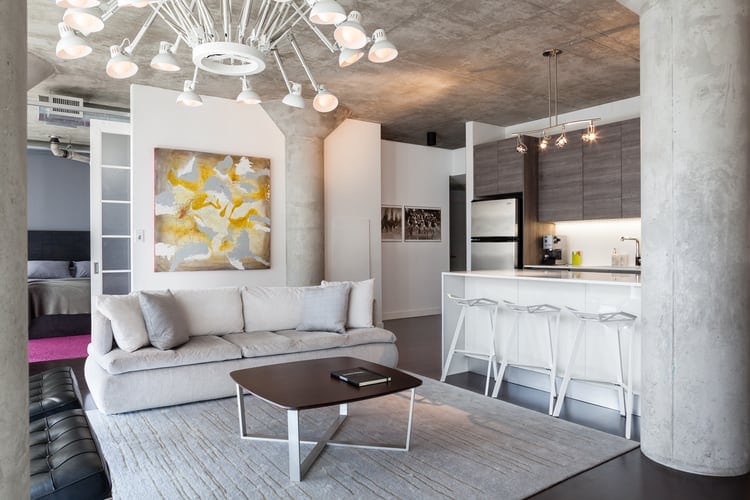
Loft 002 – Rad Design Project

Embracing Emotion: The Rise of Warmth and Texture in 2026 Interior Design Trends

Illuminating Kilkenny: Transformation of 1820s Latrine Into a Modern Studio with Historic Roots

Förstberg Ling Crafts an Innovative Extension to a Historic 1912 Swedish Home near Söderåsen Nationa...
