The Birth of the Michelin Man
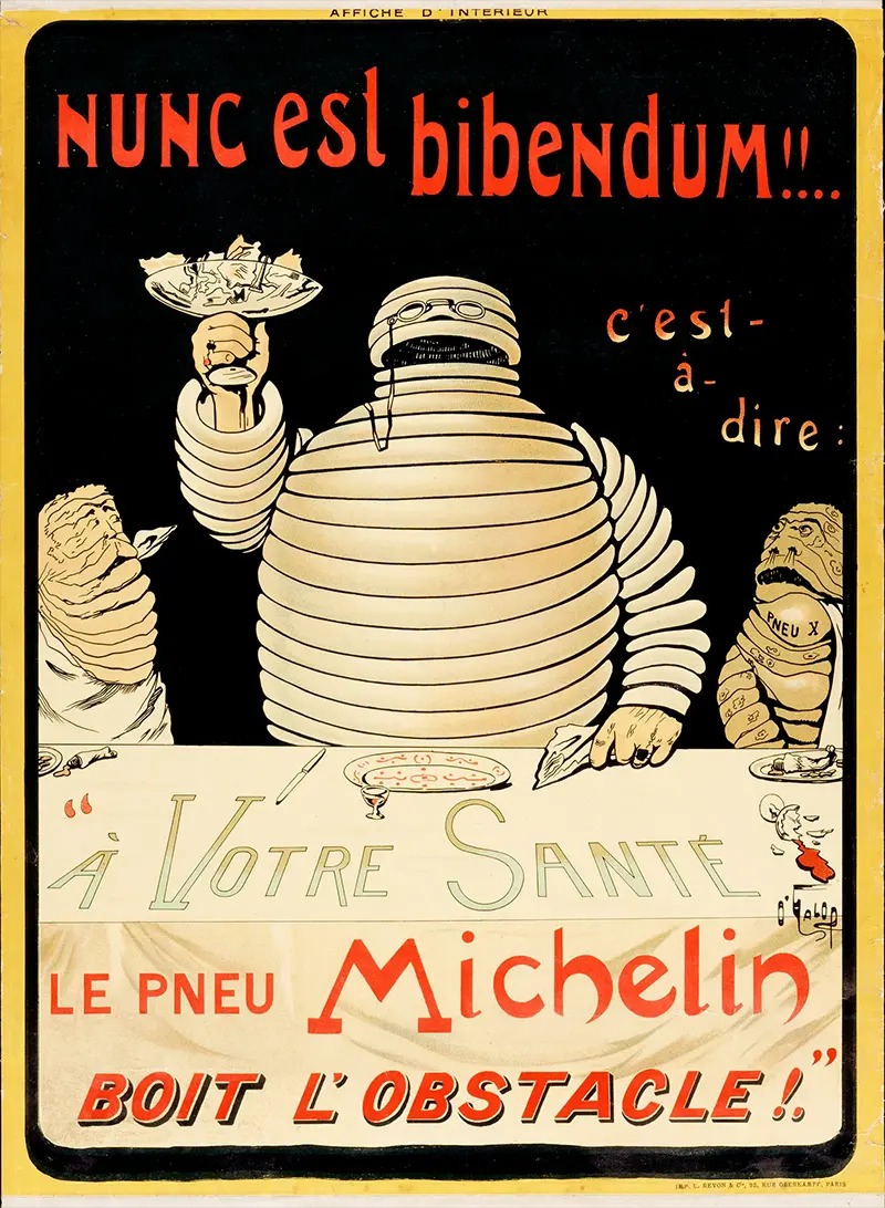
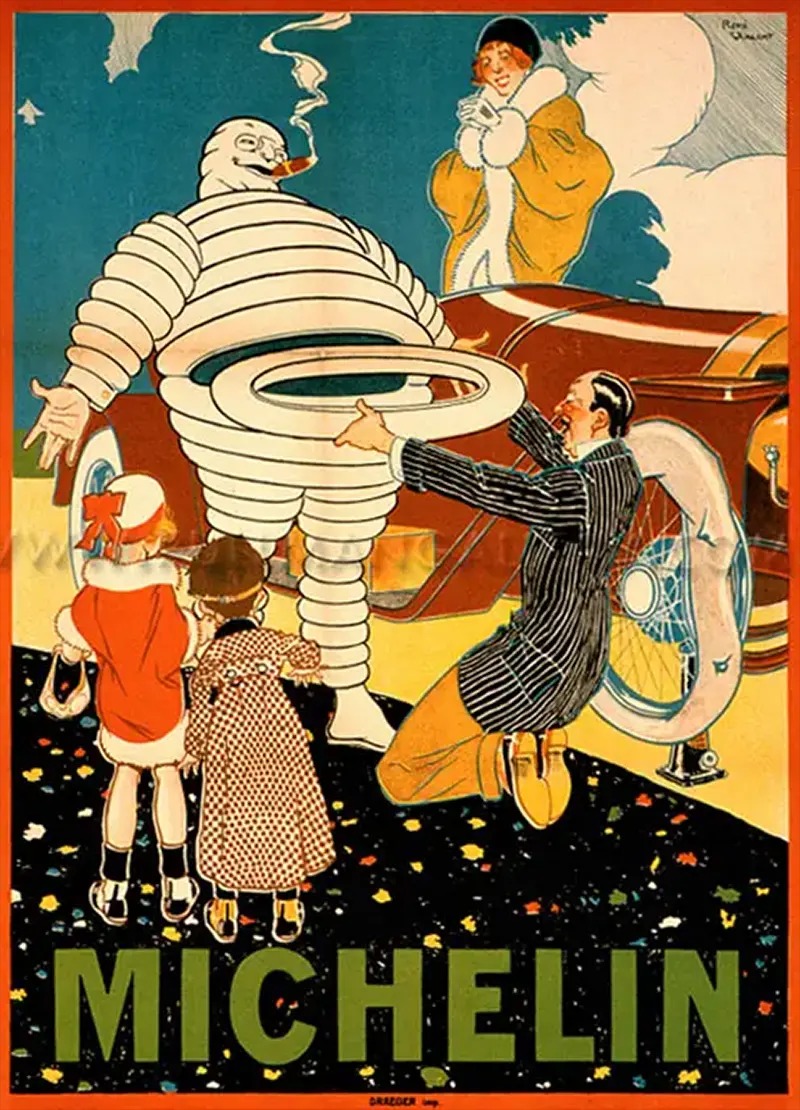
The emblematic figure known as the Michelin Man was birthed in the late 19th century, specifically in 1894, when André and Édouard Michelin established Michelin & Cie, their tire manufacturing enterprise. The idea for this now-iconic mascot crystallized when the brothers observed a pile of tires and remarked on its human-like appearance, albeit lacking arms. This perception catalyzed a partnership with O’Galop, a French illustrator, resulting in a character fashioned out of tire rubber, which ultimately became the brand’s enduring insignia.
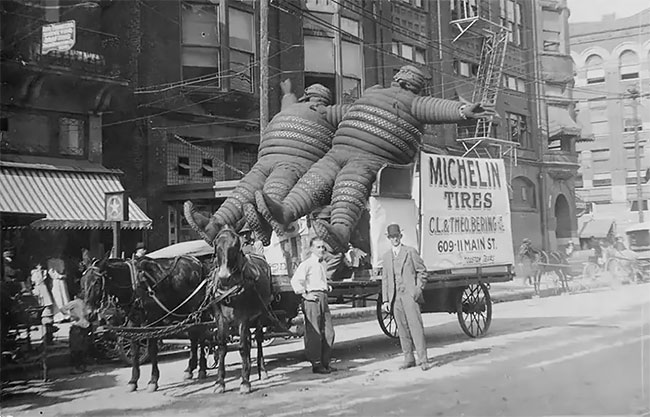
Source: rarehistoricalphotos
Historical Overview: Michelin & Cie’s Milestones
The Inception of Michelin & Cie
In 1894, the Michelin brothers founded their tire company with the aim to produce top-quality rubber tires. The company, Michelin, based in Clermont-Ferrand, France, would soon revolutionize the tire industry and become a global leader. One of its earliest innovations, the removable pneumatic tire, gained widespread attention when it won the Paris-Bordeaux-Paris race in 1895. Amidst these technological advancements, the Michelin brothers discovered the potential for a company mascot, one that would be instrumental in their marketing and brand-building efforts.
| Key Milestone | Year | Details |
|---|---|---|
| Company Foundation | 1894 | Michelin & Cie is established in Clermont-Ferrand, France. |
| Removable Pneumatic Tire | 1895 | Michelin introduces its removable pneumatic tire. |
| Inception of Mascot | 1898 | The Michelin Man concept is created. |
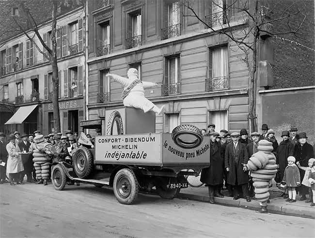
Artistic Collaboration: The Role of O’Galop
Partnership with O’Galop
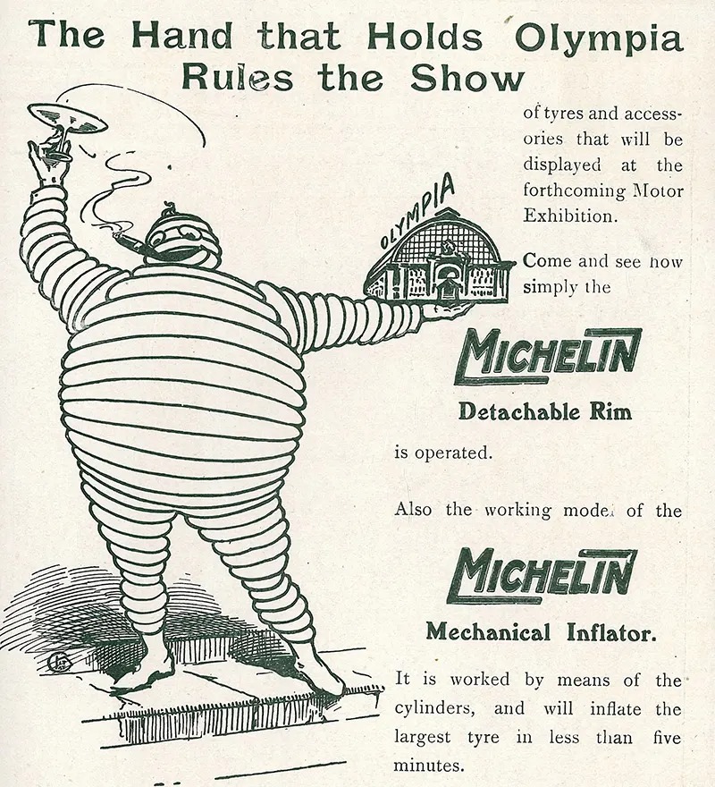
The Michelin brothers turned their concept into a reality by collaborating with Marius Rossillon, better known as O’Galop, a French cartoonist. O’Galop crafted a character from tires, originally named “Michelin Bibendum,” which quickly became Michelin’s corporate symbol. His initial illustrations showcased the Michelin Man smoking a cigar and raising a glass filled with nails and broken glass, representing the company’s ability to “digest” obstacles.
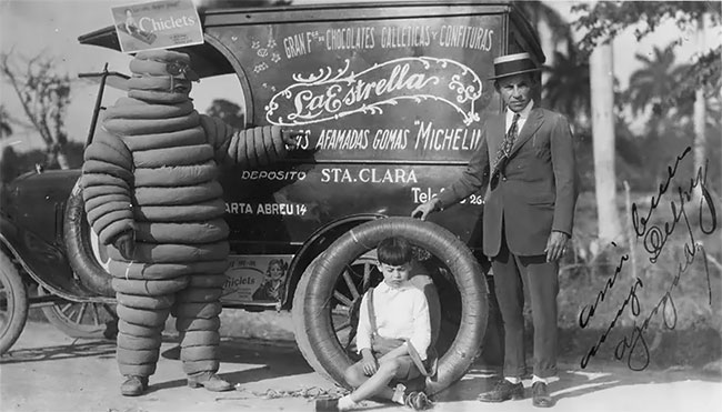
The Michelin Man’s Evolution: From Sketch to Icon
Evolution Over Time
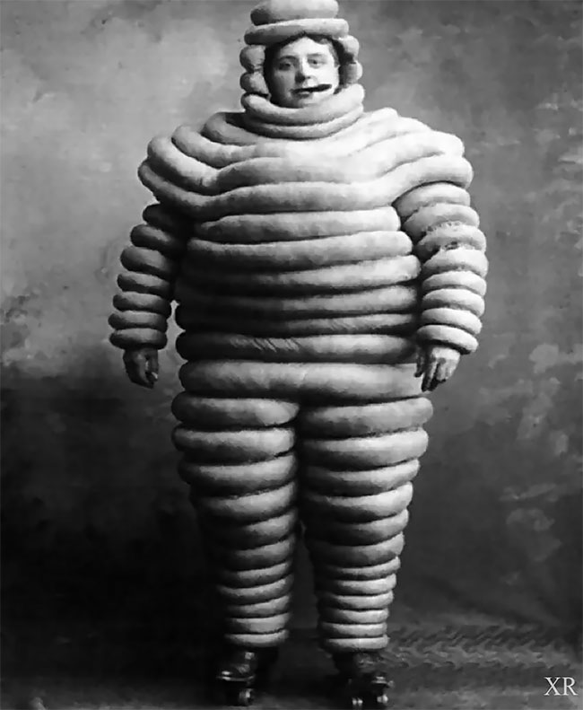
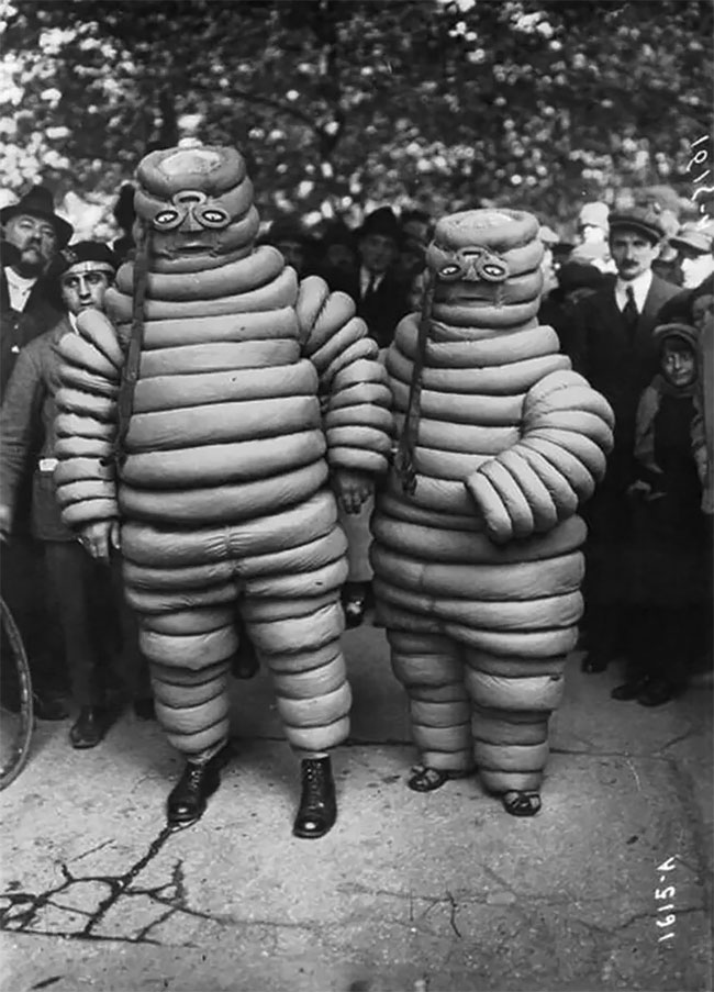
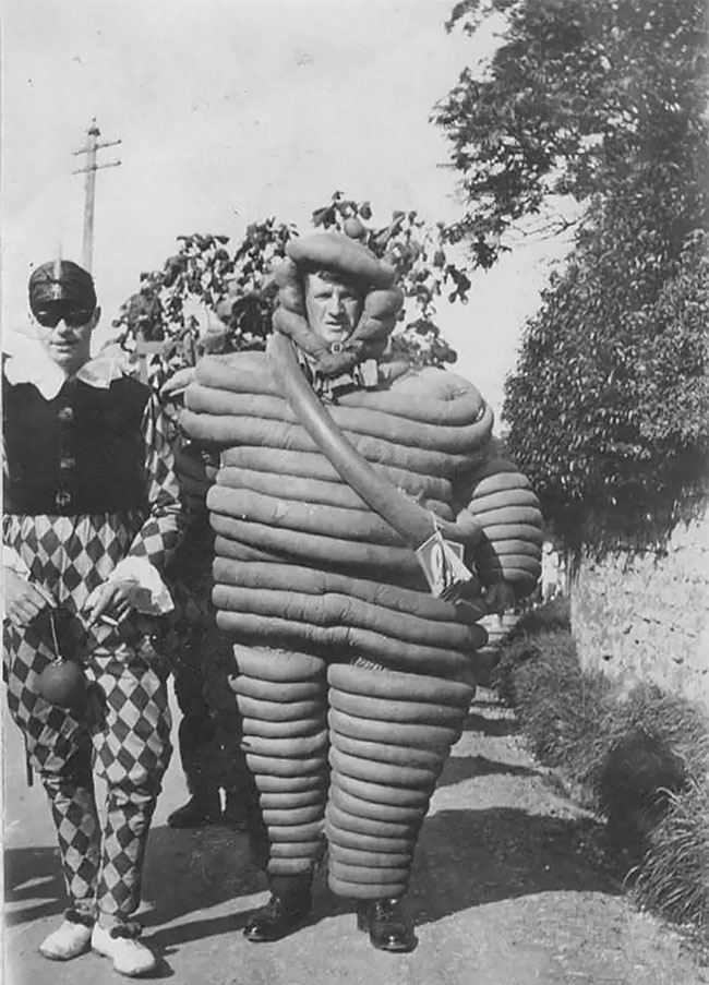
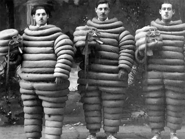
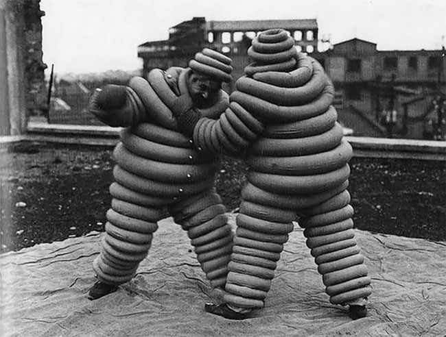
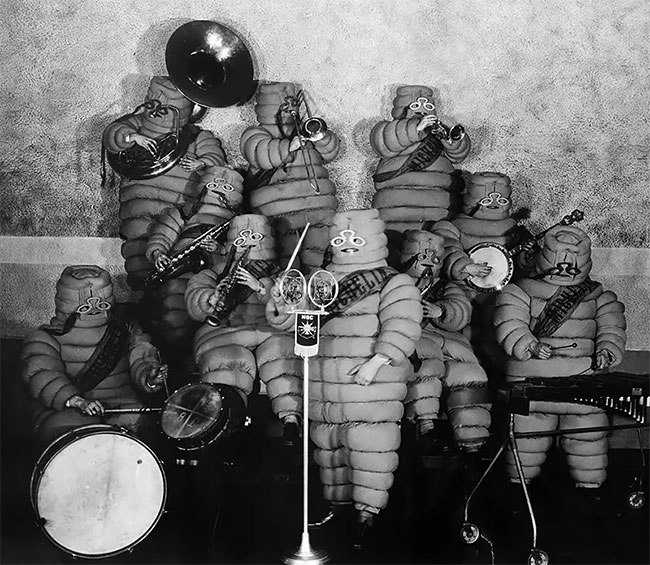
Through the years, the Michelin Man morphed from a two-dimensional illustrative creation to a three-dimensional character complete with facial expressions and accessories. A range of vintage photographs document the evolutionary journey of this emblematic figure.
| Aspect | Original Design | Current Design |
|---|---|---|
| Dimension | Two-dimensional | Three-dimensional |
| Color | White | White |
| Accessories | Cigar, Glass | None |
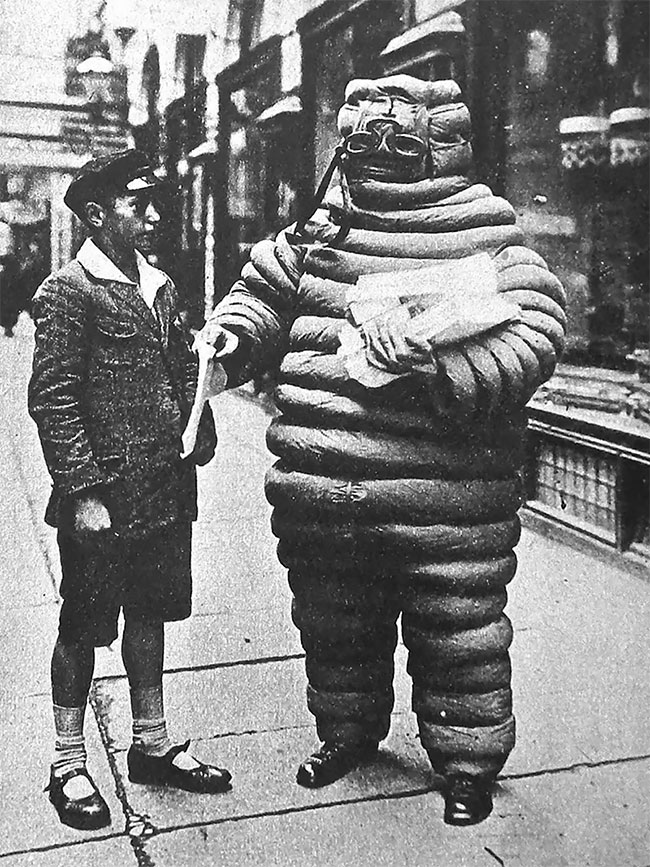
The Color Shift and its Reversion
For a brief period, Michelin experimented by changing the mascot’s color to black. However, this decision was reversed, primarily due to concerns related to printing techniques and aesthetics. Contrary to popular belief, this change had no racial undertones.
Adaptability and Relevance: Keeping Up with the Times
Adapting to Technological Advancements and Trends
As technology advanced and societal preferences changed, so did the Michelin Man’s shape and accessories. Although the basic essence of the character remained consistent, subtle modifications were made to ensure the Michelin Man remained contemporary and relevant.
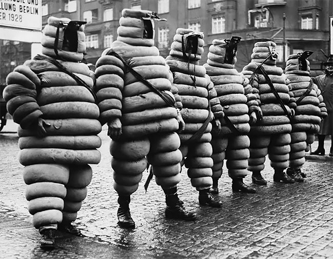
Cultural Impact and Future Trajectory
Cultural Impact
The Michelin Man has had a profound impact on popular culture, serving as more than just a corporate logo. Over the decades, the character has been featured in various forms of media, including print advertisements, television commercials, and digital platforms. The character’s adaptability has been instrumental in its enduring allure.
Future Prospects
The onset of emerging technologies like augmented and virtual reality presents new opportunities for the Michelin Man to evolve further while preserving its core identity. It is anticipated that as technology continues to advance, this iconic figure will adapt accordingly, sustaining its charm and impact on popular culture.
Conclusion: An Everlasting Symbol
In summary, the Michelin Man serves as a powerful example of how a simple concept can transform into an iconic symbol with a life of its own. Originating from a humble stack of tires and envisioned by two innovative brothers, the Michelin Man has transcended its role as a mere company mascot. Over more than a century, it has undergone various transformations, yet has never lost its core essence or its ability to captivate audiences across multiple media channels. Its future looks promising, with anticipated adaptations to align with technological advancements while staying true to its original charm.
