Tim Burton is an American film director, producer, writer, artist, and animator known for Gothic fantasy films with stylised sets, exaggerated characters, and a sympathy for outcasts. His work sits at the meeting point of live-action cinema, stop-motion animation, makeup effects, production design, and illustration, and it helped make a distinctive darkly comic visual style mainstream in popular film.
| Born | 1958, Burbank, California, United States |
|---|---|
| Known for | Dark fantasy films, stop-motion animation, expressionist-inspired visuals, character-driven gothic worlds |
| Mediums | Feature film, short film, animation, illustration, photography, writing |
| Signature collaborators | Danny Elfman, Rick Heinrichs, Colleen Atwood, Henry Selick, Michael Keaton, Johnny Depp |
| Why it matters | He helped define a recognizable visual language for late-20th-century fantasy cinema and influenced fashion, illustration, advertising, and makeup design |
What defines Burton’s style?
Burton’s films usually combine high-contrast lighting, angular architecture, pale skin against black clothing, and a fondness for crooked silhouettes and handmade surfaces. The settings often look built rather than found: painted backdrops, miniatures, matte effects, latex prosthetics, and stop-motion figures give his worlds a crafted, slightly unreal quality. That artificiality is part of the point. His stories often place lonely, eccentric figures inside rigid social worlds, so the design itself becomes a way to show conflict.
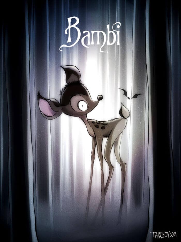
His visual vocabulary draws on German Expressionism, classic monster movies, Halloween imagery, and mid-century American suburbia, but it is not simple pastiche. He pushes those references into a highly legible pop style. A Burton character is often instantly readable by outline alone: narrow shoulders, oversized eyes, spindly limbs, and clothing that looks both theatrical and homemade.
Where did his work come from?
Burton began as an animator at Disney in the 1970s and 1980s, where he developed short-form work that already showed his taste for the odd and macabre. Early pieces such as Vincent and Frankenweenie used stop-motion and live-action hybrid methods to turn childhood unease, monster lore, and suburban detail into something playful rather than merely grim. Disney later became the studio most closely associated with his career, even though his sensibility often sat outside the company’s traditional family-image polish.
As his films moved into features, he built a long collaboration with designers, animators, and costume makers who could support his worlds at scale. Production designer Rick Heinrichs, costume designer Colleen Atwood, and composer Danny Elfman helped establish a consistent Burton grammar: elaborate silhouettes, hand-built environments, and music that swings between whimsy and menace. His best-known films are not only directed by him; they are assembled through a network of material choices that make the style feel coherent from frame to frame.
What does a Burton film look like in practice?
In practice, a Burton film often relies on visible fabrication. Sets may be oversized or distorted to make human figures appear fragile; costumes exaggerate shape through seams, padding, collars, and stripes; and makeup can flatten faces into masks or turn them into caricature. Stop-motion work in The Nightmare Before Christmas and Corpse Bride uses tiny articulated puppets, replacement faces, and meticulously lit miniature environments to create movement that feels both delicate and eerie.
His live-action films often use the same logic even when they do not use animation. Edward Scissorhands contrasts suburban pastel houses with a black-clad outsider whose hands are literal blades, while Batman Returns turns Gotham into a wet, industrial gothic city of stone gargoyles and harsh shadow. The effect depends on design discipline: color palettes are restricted, props are eccentric but consistent, and the worlds feel governed by their own rules.
Why does Tim Burton matter?
Burton mattered because he made a commercially successful version of the strange. Before his rise, goth and monster aesthetics were often treated as niche or adolescent; his films moved those traits into mainstream cinema, merchandising, theme-park design, Halloween retail, and fashion imagery. The result is that Burton’s look became one of the most recognizable visual brands in contemporary culture.
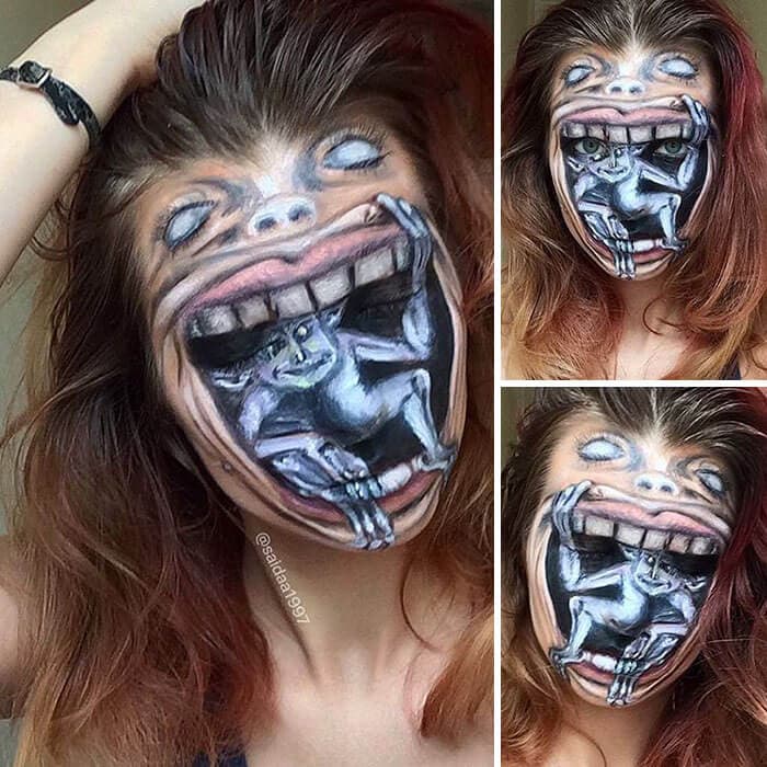
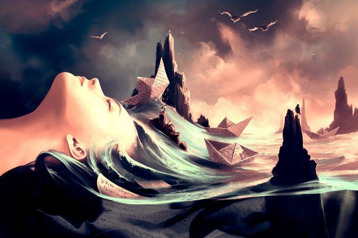
He also helped legitimise the idea that a director could build a world through design as much as through plot. His films are studied not only as stories but as combinations of illustration, sculpture, costume, lighting, and animation. For artists working in makeup, character design, and surreal digital painting, Burton offers a clear model for how to make a figure feel both stylised and emotionally specific.
Frequently Asked Questions
Is Tim Burton an animator or a film director?
He is both. Burton trained and worked as an animator early in his career, and animation continues to shape how he thinks about gesture, character design, and movement. Even his live-action films often behave like animated worlds built from precise visual rules.
What makes a film look “Burton-esque”?
The usual signs are high-contrast lighting, gothic or fairytale settings, exaggerated proportions, and characters who look slightly off-balance in the frame. Black-and-white stripes, skeletal forms, twisted trees, and handmade textures often appear as shorthand, but the deeper feature is a contrast between outsider characters and rigid, uniform environments.
Did Burton invent stop-motion or Gothic fantasy cinema?
No. Stop-motion long predates him, and Gothic fantasy has a much older history in literature, theatre, and film. Burton’s contribution was to give these modes a modern mainstream visibility and a very specific pop-culture identity that many later creators have borrowed, quoted, or parodied.
Articles mentioning Tim Burton